An appreciation of the ShackBurger
From The Message is Medium Rare, an appreciation of the ShackBurger, “a straightforward, honest-to-goodness burger”. It includes a review of the typography used by the restaurant:
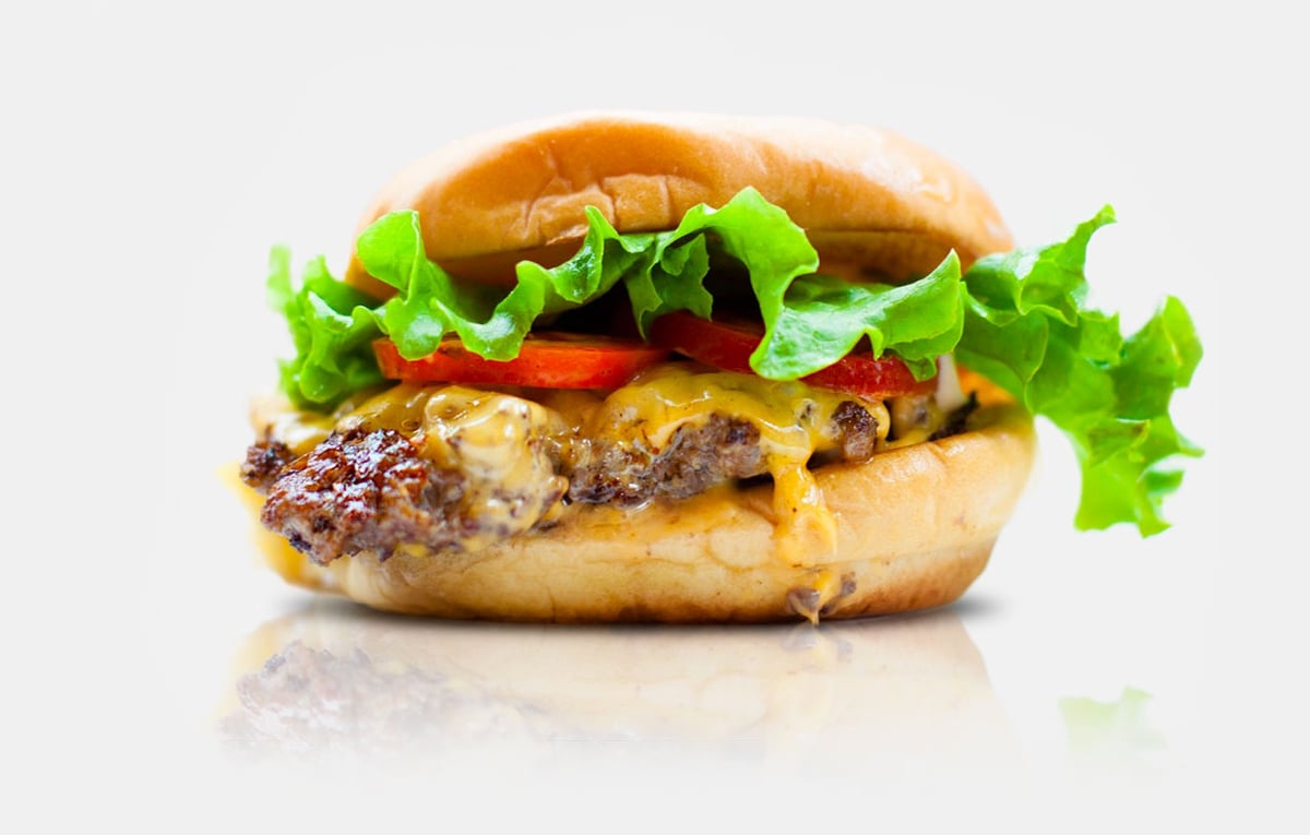
These three typefaces artfully express the ethos of both the burger and the brand. Neutraface is the bun: sturdy, reliable and architectural. Futura is the patty: basic but bold. Galaxie is the lettuce: wavy, quirky and fresh. To the layperson this comparison may seem like a stretch, but designers know they are purposefully expressive.
Stay Connected