In this entertaining and informative video, Oliver Bullough, who has written a pair of books on money laundering (Moneyland and the forthcoming Butler to the World) takes us on a tour of London while telling us how “the most efficient scaled-up money laundering system in the world” has helped Russia’s oligarchs hide their billions and keep Putin in power. Bullough also wrote about the UK’s role in laundering oligarch money recently in The Guardian.
Russia is a mafia state, and its elite exists to enrich itself. Democracy is an existential threat to that theft, which is why Putin has crushed it at home and seeks to undermine it abroad. For decades, London has been the most important place not only for Russia’s criminal elite to launder its money, but also for it to stash its wealth. We have been the Kremlin’s bankers, and provided its elite with the financial skills it lacks. Its kleptocracy could not exist without our assistance. The best time to do something about this was 30 years ago — but the second best time is right now.
We journalists have long been writing about this, but it is not simply overheated rhetoric from overexcited hacks. Parliament’s intelligence and security committee wrote two years ago that our investigative agencies are underfunded, our economy is awash with dirty money, and oligarchs have bought influence at the very top of our society.
Ollie Bye has created an animated time lapse of the growth of London from a small Roman town in 47 ACE to the largest city in the world (during the Victorian era) to the massive, sprawling city it is today.
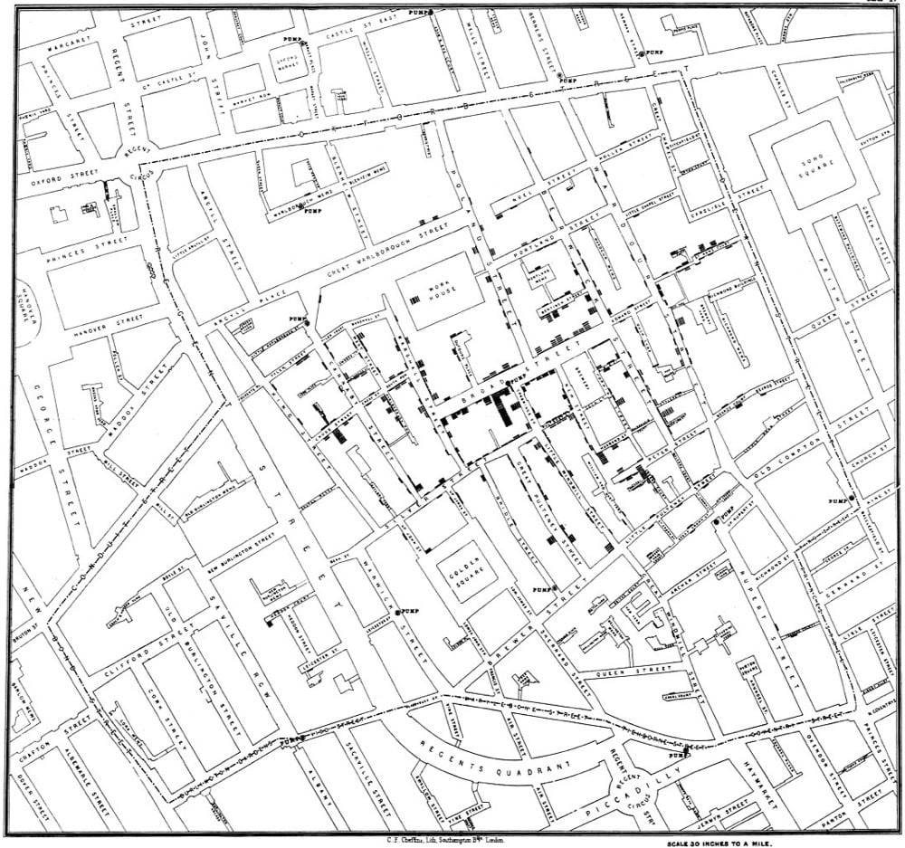
In 1854, Dr. John Snow produced a map of a London cholera outbreak which showed deaths from the disease concentrated around a water pump on Broad Street. The prevailing view at the time was that cholera spread through dirty air, but Snow hypothesized that it was actually spread through water and constructed this early medical data visualization to help prove it.
Through a mix of personal interviews, clever detective work, and data analysis that included tables and a famous map, Snow managed to stop the outbreak and convince local public health officials, eventually, that cholera could be transmitted through water, not a miasma. Since his breakthrough study, the map has become an iconic piece of epidemiological history, as an illustration of keen detective work, analysis, and visual representation with a map that, even today, tells a story.
Aside from the cluster of deaths around the pump (which could be argued were the result of a miasma cloud and not contaminated water), stories of nearby people who didn’t get sick (brewers who drank the beer they produced rather than well water, people in buildings with their own wells) and far away people who died because they had drunk water from the well were also essential in proving his theory:
I was informed by this lady’s son that she had not been in the neighbourhood of Broad Street for many months. A cart went from broad Street to West End every day and it was the custom to take out a large bottle of the water from the pump in Broad Street, as she preferred it. The water was taken on Thursday 31st August., and she drank of it in the evening, and also on Friday. She was seized with cholera on the evening of the latter day, and died on Saturday
You can read more about John Snow and how his map changed science and medicine in Steven Johnson’s excellent Ghost Map.
Including some irregular times off, overall it took me four years to visit every single road on the map. When I started this hobby, it took me 30 to 40 minutes to do the route. Later it expanded to 2 hours to get to the office when I tried to reach the furthest places on my map. One of the main goals was never to be late for work. From the beginning, I planned to visit not only the main roads but every single accessible mews, yard, park trail, and a path that was possible to go through. I used Endomondo app to have a proper record of my journeys and proof that I have been there. After every trip, I prepared my next route in Google maps where it was easy to adjust streets to the next ones and mark points to revisit if I missed something.
In the NY Times, architect and urban designer John Massengale discusses how four European cities (London, Amsterdam, Stockholm, Copenhagen) addressed their urban traffic problems and how NYC might apply those lessons to fix its own traffic issues. Massengale shared what the Dutch learned in reconfiguring their streets:
1. When drivers slow down to 20 m.p.h. or below, they are less likely to hit people and much less likely to seriously injure or kill people if they do hit them.
2. The best way to slow cars down is to throw away all the techniques that traffic engineers developed to make traffic flow quickly.
3. When you throw out all the detritus of traffic engineering, it becomes much easier to make beautiful places where people want to walk. Bike riding becomes more pleasant and safer as well.
His four-step plan to fix traffic in Manhattan is equally simple in principle:
The next step is to adopt congestion pricing below 96th Street in Manhattan and then:
1. Decrease the number of Manhattan streets that function as transportation corridors primarily devoted to moving machines through the city.
2. Design and build Slow Zones where people actually drive slowly.
3. Make the transportation corridors that remain better urban places, with a better balance between city life and moving cars.
Seems to me a vital part of this is fixing, expanding, and subsidizing the subway system…get everyone using the subway. Better, more reliable, and cheaper public transportation = less demand for taxis and Lyfts. As Bogota mayor Enrique Peñalosa said, “A developed country is not a place where the poor have cars. It’s where the rich use public transport.”
After Piet Mondrian moved to New York in 1940, his work became influenced by Manhattan’s grid system, particularly expressed in Broadway Boogie Woogie. Similarly, for his City DNA project, Xinjian Lu studied satellite maps of cities like Beijing, Athens, New York, and Los Angeles and then created these maze-like paintings that resemble the street layouts of each city. Mondrian++. Holy moly, I *love* these.
From top to bottom, Lu’s paintings depict Beijing, London, and Paris.
In 2012, Francois De La Taille posted a video of himself racing a Paris Metro train from one station to the next, on foot. He exited the train, dashed out of the station, sprinted down the street (after pausing for a bus crossing the road), ran into the next station (after falling on the stairs), and hopped back onto the same train he’d just gotten off of.
Two years later, James Heptonstall did the same thing on the London Tube and, after a slow start, it went viral. Soon, people from all over the world were racing their hometown subway trains: Taiwan, Stockholm, Hong Kong, etc. If you’re wondering whether such a thing would be possible in NYC, the answer is yes, even if you pick the wrong door to start with:
Covering an actual time of 20 minutes, you can watch this time lapse of smog rolling into Beijing in a matter of a few seconds. The NY Times has a short piece on the video, which was filmed on January 2.
Residents have come to expect such dense air pollution in the late fall and winter, as people burn coal to heat their homes. Recently, the problem has been particularly bad, and the city has been enveloped in smog for extended periods starting in October.
Mr. Pope, writing on Twitter, pegged the air quality index, a measure of the pollution, above 400 around the time of the video. The United States government rates readings of 301 to 500 as “hazardous.”
What a disaster…and the air wasn’t that clear before the smog rolled in. I’ve been to Beijing once, back in 1995, and even though I’d love to see how the city has changed over the past 20 years, I have no interest in returning until they get their air quality under control.
By law, hourly levels of toxic nitrogen dioxide must not be more than 200 micrograms per cubic metre (µg/m3) more than 18 times in a whole year, but late on Thursday this limit was broken on Brixton Road in Lambeth.
Many other sites across the capital will go on to break the annual limit and Putney High Street exceeded the hourly limit over 1,200 times in 2016. Oxford Street, Kings Road in Chelsea and the Strand are other known pollution hotspots.
Great piece about The Knowledge, the collection of geographical information that all London taxi drivers must learn before becoming a cabbie.
The guidebook issued to prospective cabbies by London Taxi and Private Hire (LTPH), which oversees the test, summarizes the task like this:
To achieve the required standard to be licensed as an “All London” taxi driver you will need a thorough knowledge, primarily, of the area within a six-mile radius of Charing Cross. You will need to know: all the streets; housing estates; parks and open spaces; government offices and departments; financial and commercial centres; diplomatic premises; town halls; registry offices; hospitals; places of worship; sports stadiums and leisure centres; airline offices; stations; hotels; clubs; theatres; cinemas; museums; art galleries; schools; colleges and universities; police stations and headquarters buildings; civil, criminal and coroner’s courts; prisons; and places of interest to tourists. In fact, anywhere a taxi passenger might ask to be taken.
If anything, this description understates the case. The six-mile radius from Charing Cross, the putative center-point of London marked by an equestrian statue of King Charles I, takes in some 25,000 streets. London cabbies need to know all of those streets, and how to drive them — the direction they run, which are one-way, which are dead ends, where to enter and exit traffic circles, and so on. But cabbies also need to know everything on the streets. Examiners may ask a would-be cabby to identify the location of any restaurant in London. Any pub, any shop, any landmark, no matter how small or obscure — all are fair game. Test-takers have been asked to name the whereabouts of flower stands, of laundromats, of commemorative plaques. One taxi driver told me that he was asked the location of a statue, just a foot tall, depicting two mice sharing a piece of cheese. It’s on the facade of a building in Philpot Lane, on the corner of Eastcheap, not far from London Bridge.
The goal is to install a complete map of London in the brain of every licensed taxi driver. And indeed, according to neuroscientist Eleanor Maguire, the part of the brain responsible for memory becomes physically bigger as The Knowledge is absorbed.
Seeing, for a Knowledge candidate, is everything — at its heart, the Knowledge is an elaborate exercise in visualization. When McCabe called-over, he closed his eyes and toggled between views: picturing the city at street level, the roads rolling out in front of him as if in a movie, then pulling the camera back to take in the bird’s eye perspective, scanning the London map. Knowledge boys speak of a Eureka moment when, after months or years of doggedly assembling the London puzzle, the fuzziness recedes and the city snaps into focus, the great morass of streets suddenly appearing as an intelligible whole. McCabe was startled not just by that macroview, but by the minute details he was able to retain. “I can pull a tiny little art studio just from the color of the door, and where it’s got a lamppost outside. Your brain just remembers silly things, you know?”
I could go on and on…I loved this piece. Don’t miss the video of a prospective cabbie calling out the route he would use to go from Rotherhithe Station to the Natural History Museum, entirely from memory without looking at a map. Compare with Google’s driving directions.
In light of the ongoing policing situation in Ferguson, Missouri in the wake of the shooting of an unarmed man by a police officer and how the response to the community protests is highlighting the militarization of US police departments since 9/11, it’s instructive to look at one of the first and most successful attempts at the formation of a professional police force.
The UK Parliament passed the first Metropolitan Police Act in 1829. The act was introduced by Home Secretary Sir Robert Peel, who undertook a study of crime and policing, which resulted in his belief that the keys to building an effective police force were to 1) make it professional (most prior policing had been volunteer in nature); 2) organize as a civilian force, not as a paramilitary force; and 3) make the police accountable to the public. The Metropolitan Police, whose officers were referred to as “bobbies” after Peel, was extremely successful and became the model for the modern urban police force, both in the UK and around the world, including in the United States.
At the heart of the Metropolitan Police’s charter were a set of rules either written by Peel or drawn up at some later date by the two founding Commissioners: The Nine Principles of Policing. They are as follows:
1. To prevent crime and disorder, as an alternative to their repression by military force and severity of legal punishment.
2. To recognise always that the power of the police to fulfil their functions and duties is dependent on public approval of their existence, actions and behaviour, and on their ability to secure and maintain public respect.
3. To recognise always that to secure and maintain the respect and approval of the public means also the securing of the willing co-operation of the public in the task of securing observance of laws.
4. To recognise always that the extent to which the co-operation of the public can be secured diminishes proportionately the necessity of the use of physical force and compulsion for achieving police objectives.
5. To seek and preserve public favour, not by pandering to public opinion, but by constantly demonstrating absolutely impartial service to law, in complete independence of policy, and without regard to the justice or injustice of the substance of individual laws, by ready offering of individual service and friendship to all members of the public without regard to their wealth or social standing, by ready exercise of courtesy and friendly good humour, and by ready offering of individual sacrifice in protecting and preserving life.
6. To use physical force only when the exercise of persuasion, advice and warning is found to be insufficient to obtain public co-operation to an extent necessary to secure observance of law or to restore order, and to use only the minimum degree of physical force which is necessary on any particular occasion for achieving a police objective.
7. To maintain at all times a relationship with the public that gives reality to the historic tradition that the police are the public and that the public are the police, the police being only members of the public who are paid to give full-time attention to duties which are incumbent on every citizen in the interests of community welfare and existence.
8. To recognise always the need for strict adherence to police-executive functions, and to refrain from even seeming to usurp the powers of the judiciary of avenging individuals or the State, and of authoritatively judging guilt and punishing the guilty.
9. To recognise always that the test of police efficiency is the absence of crime and disorder, and not the visible evidence of police action in dealing with them.
As police historian Charles Reith noted in 1956, this philosophy was radical when implemented in London in the 1830s and “unique in history and throughout the world because it derived not from fear but almost exclusively from public co-operation with the police, induced by them designedly by behaviour which secures and maintains for them the approval, respect and affection of the public”. Apparently, it remains radical in the United States in 2014. (thx, peter)
An instant classic John Gruber post about the sort of company Apple is right now and how it compares in that regard to its four main competitors: Google, Samsung, Microsoft, and Amazon. The post is also about how Apple is now firmly a Tim Cook joint, and the company is better for it.
When Cook succeeded Jobs, the question we all asked was more or less binary: Would Apple decline without Steve Jobs? What seems to have gone largely unconsidered is whether Apple would thrive with Cook at the helm, achieving things the company wasn’t able to do under the leadership of the autocratic and mercurial Jobs.
Jobs was a great CEO for leading Apple to become big. But Cook is a great CEO for leading Apple now that it is big, to allow the company to take advantage of its size and success. Matt Drance said it, and so will I: What we saw last week at WWDC 2014 would not have happened under Steve Jobs.
This is not to say Apple is better off without Steve Jobs. But I do think it’s becoming clear that the company, today, might be better off with Tim Cook as CEO. If Jobs were still with us, his ideal role today might be that of an eminence grise, muse and partner to Jony Ive in the design of new products, and of course public presenter extraordinaire. Chairman of the board, with Cook as CEO, running the company much as he actually is today.
This bit on the commoditization of hardware, and Apple’s spectacularly successful fight against it, got me thinking about current events. Here’s Gruber again:
Apple’s device-centric approach provides them with control. There’s a long-standing and perhaps everlasting belief in the computer industry that hardware is destined for commoditization. At their cores, Microsoft and Google were founded on that belief - and they succeeded handsomely. Microsoft’s Windows empire was built atop commodity PC hardware. Google’s search empire was built atop web browsers running on any and all computers. (Google also made a huge bet on commodity hardware for their incredible back-end infrastructure. Google’s infrastructure is both massive and massively redundant - thousands and thousands of cheap hardware servers running custom software designed such that failure of individual machines is completely expected.)
This is probably the central axiom of the Church of Market Share - if hardware is destined for commoditization, then the only thing that matters is maximizing the share of devices running your OS (Microsoft) or using your online services (Google).
The entirety of Apple’s post-NeXT reunification success has been in defiance of that belief - that commoditization is inevitable, but won’t necessarily consume the entire market. It started with the iMac, and the notion that the design of computer hardware mattered. It carried through to the iPod, which faced predictions of imminent decline in the face of commodity music players all the way until it was cannibalized by the iPhone.
And here’s David Galbraith tweeting about the seemingly unrelated training that London taxi drivers receive, a comment no doubt spurred by the European taxi strikes last week, protesting Uber’s move into Europe:
Here’s the relevant bit from Wikipedia about The Knowledge:
It is the world’s most demanding training course for taxicab drivers, and applicants will usually need at least twelve ‘appearances’ (attempts at the final test), after preparation averaging 34 months, to pass the examination.
Uber, in this scenario, is attempting to be Microsoft in the 1980s and early 90s. They’re implementing their software layer (the Uber service) on commodity hardware, which includes not only iPhones & Android phones, mass-produced cars of any type, and GPS systems but also, and crucially, the drivers themselves. Uber is betting that a bunch of off-the-shelf hardware, “ordinary” drivers, and their self-service easy-pay dispatch system will provide similar (or even better) results than a fleet of taxi drivers each with three years of training and years of experience. It is unclear to me what the taxi drivers can do in this situation to emulate the Apple of 1997 in making that commoditization irrelevant to their business prospects. Although when it comes to London in particular, Uber may have miscalculated: in a recent comparison at rush hour, an Uber cab took almost three times as long and was 64% more expensive than a black cab.
Film shot of London street scenes, mostly from the 1890s and 1900s.
There’s also a brief shot of Paris in 1900 right at the end. See also the extremely rare footage of Queen Victoria visiting Dublin in 1900. The Victorian era seems so long ago (and indeed she began her reign in 1837) but there she is on the modern medium of film. Yet another example of the Great Span.
In 1953, the BBC filmed a train trip from London to Brighton. Thirty years later in 1983, they filmed it again and then again 30 years after that, in 2013. Here are all three films synced up and played side-by-side:
1000 extra bonus points to the Beeb for the Star Guitar soundtrack.
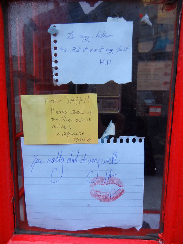
[Sherlock season 2 spoilers ahead…] At the end of the second season of the excellent BBC series Sherlock, Holmes jumps off the roof of a building in Smithfield, London. Ever since then, fans of the show have been leaving notes near where he would have landed.
You may remember the New York version. This is the same deal — asking people on the street what song they’re listening to on their headphones — except in London.
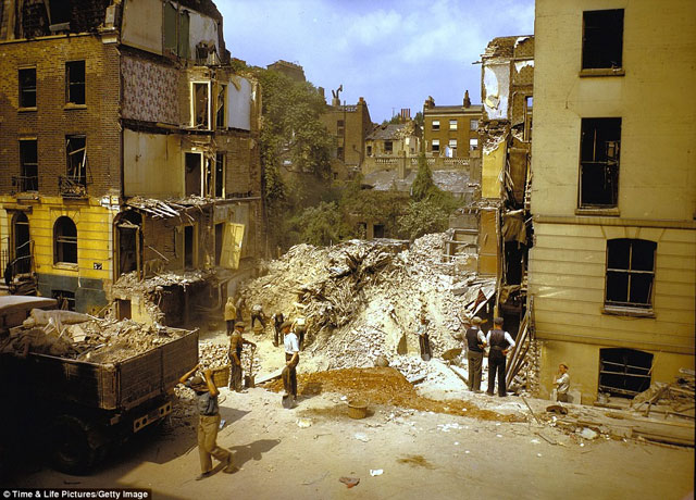
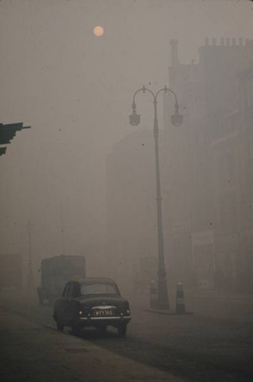
In December 1952, a thick smog settled over London for several days. This was a particularly bad episode of the London Fog, which was hardly a natural occurrence…the “fog” was mostly due to the burning of soft coal. It is now thought that the Great Smog resulted in around 12,000 deaths.
The room is filled with millions of handcrafted ceramic sunflower seeds:
Each seed has been individually sculpted and painted by specialists working in small-scale workshops in the Chinese city of Jingdezhen. Far from being industrially produced, they are the effort of hundreds of skilled hands. Poured into the interior of the Turbine Hall’s vast industrial space, the 100 million seeds form a seemingly infinite landscape.
Porcelain is almost synonymous with China and, to make this work, Ai Weiwei has manipulated traditional methods of crafting what has historically been one of China’s most prized exports. Sunflower Seeds invites us to look more closely at the ‘Made in China’ phenomenon and the geo-politics of cultural and economic exchange today.
For the first couple of days, people could walk around on the tiny sculptures (as you can see on Flickr), but health concerns prompted the museum to put a stop to that. Still pretty cool, but this remains my favorite Turbine Hall exhibition. (via hilobrow)
This clip is from a larger film called The Open Road by Claude Friese-Greene. He shot the film with a process his father William had developed called Biocolour.
William began the development of an additive colour film process called Biocolour. This process produced the illusion of true colour by exposing each alternate frame of ordinary black-and-white film stock through a two different coloured filters. Each alternate frame of the monochrome print was then stained red or green. Although the projection of Biocolour prints did provide a tolerable illusion of true colour, it suffered from noticeable flickering and red-and-green fringing when the subject was in rapid motion. In an attempt to overcome the colour fringing problem, a faster-than-usual frame rate was used.
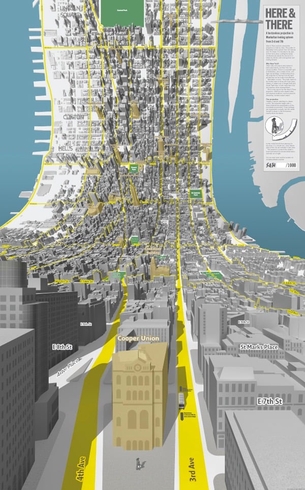
This is a little bit brilliant. Here and There are a pair of maps of Manhattan that start from an on-the-street viewpoint and curl up as you gaze uptown or downtown until you see the rest of the island from a traditional “flat map” view.
As the model bends from sideways to top-down in a smooth join, more distant parts of the city are revealed in plan view. The projection connects the viewer’s local environment to remote destinations normally out of sight.
Prints are available. This is like a 3-D version of the spider maps for London buses, in which a local street grid relays information about the immediate vicinity while the surrounding schematic shows connections to the rest of the system.
Update: Ooh, these science illustrations from NISE use a similar technique to simultaneously show the internal and external structure of their subjects.
These illustrations show familiar objects across ten orders of magnitude-from familiar aspects down to the level of their constituent atoms. Vast scale differences are usually shown through separate images (e.g., the Eames’ Powers of Ten). This illustration employs the artistic convention of perspective-typically used by landscape painters-to show multiple scales in one frame.
So why did the Paris Metro (now operated by the RATP) reject Beck’s clear simplification of their beloved system? One reason is visible at each station entrance; Parisians use the maps here as a free public service to help them find their way round the city - the ubiquitous geographic wall map is more than just a Metro plan.


Stay Connected