From Patrick Willems, a history and celebration/defense of movie opening title sequences. They have fallen out of favor over the past decade or two, but Willems argues they serve a needed purpose. For instance, opening title sequences can set the tone or theme of the film before it even gets started — that’s what Saul Bass set out to do:
Bass called this “creating a climate for the story”. Here’s one of Willems’ favorite opening sequences by Bass, from 1966’s Grand Prix, which I’d somehow never seen before and is fantastic:
Me? I love opening title sequences. (Except when they are bad and too long.) But I also love when the movie starts right away. And when the movie starts right away and then you get a title card like 8 minutes into it. I’m a fan of anything when it’s done well. *shrugs*
P.S. You can check out hundreds of great examples of opening title sequences at Art of the Title.
Saul Bass is one of the most celebrated designers of movie posters and title sequences in the short history of cinema. He created iconic poster designs for movies like Vertigo, The Shining, Anatomy of a Murder, and Schindler’s List. In this short film, we learn the strategy behind Bass’ designs: symbolize and summarize.
I began as a graphic designer. As part of my work, I created film symbols for ad campaigns. I happened to be working on the symbols for Otto Preminger’s Carmen Jones and The Man With The Golden Arm and at some point, Otto and I just looked at each other and said, “Why not make it move?”
It was as simple as that.
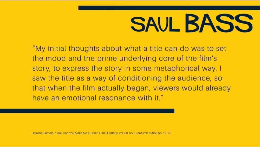
I had felt for some time that audience involvement with a film should begin with its first frame.
Until then, titles had tended to be lists of dull credits, mostly ignored, endured, or used as popcorn time.
There seemed to be a real opportunity to use titles in a new way — to actually create a climate for the story that was about to unfold.
No where in that excerpt did Bass or the interviewer reference Bass’ wife and collaborator Elaine Bass, who worked closely with him on almost all of their film projects. In recent years, there’s been a push to recontextualize their working relationship as a partnership. Elaine did start off working as his employee but clearly they worked as true collaborators for much of their careers.
From 1969, this is the video that Saul Bass made to pitch AT&T on a new corporate identity. What a time capsule. Here’s the logo, which remained in use until 1983, when Bass designed the “Death Star” logo to replace it.
Saul Bass designed the opening sequences for dozens of films, including North by Northwest, Psycho, West Side Story, and Goodfellas. Here’s a look at some of his best work:
This is the text of a note that was stuck on the cans when the reels of film for “The Man With the Golden Arm” arrived at US movie theatres in 1955. Until then the credits were referred to as ‘popcorn time.’ Audiences resented them and projectionists only pulled back the curtains to reveal the screen once they’d finished. Saul Bass’ powerful title sequence for “The Man With the Golden Arm” changed the way directors and designers would treat the opening titles.
.svg)
Stay Connected