I’ve been thinking about something I posted last week — in an excerpt from his new book The Work of Art, former New York magazine editor Adam Moss described the art he makes as bad: “When I left my job, I began to paint more seriously,” he wrote. “That was the beginning of my torment: I just wasn’t very good.” Or as he put it to The New Yorker: “I kind of just wasn’t any good.” Or to Vanity Fair: “I really wanted to be a good painter. What a fucking idiot I was.” Or on NPR, “I really wanted to be good, and it made the act of making art so frustrating for me.”
The book is mostly about how other artists make their work, but I’m currently more interested in what Moss has to say about himself and his art.
Later in the VF and NPR interviews, Moss says that the main lesson he learned from making the book is that with art, it’s the journey not the destination — or, “the making, not the made” (“It’s the most banal observation”) — but of course I still went looking for his paintings online. I want to see them! I didn’t find anything (per the VF article, he hasn’t shared anything publicly yet), but to Moss I say: Show them! Maybe it doesn’t matter if they’re not good. Maybe the worse, the better.
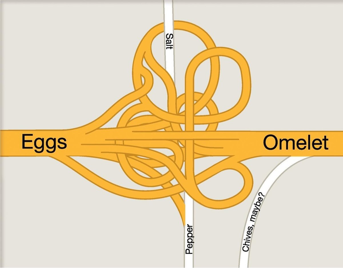
Several years ago in the Guardian, Oliver Burkeman wrote a piece called This column will change your life: Helsinki Bus Station Theory. It’s about how difficult it can be as a creative person to find your way to making work that feels like it’s uniquely yours.
There are two dozen platforms, Minkkinen explains, from each of which several different bus lines depart. Thereafter, for a kilometre or more, all the lines leaving from any one platform take the same route out of the city, making identical stops. “Each bus stop represents one year in the life of a photographer,” Minkkinen says. You pick a career direction — maybe you focus on making platinum prints of nudes — and set off. Three stops later, you’ve got a nascent body of work. “You take those three years of work on the nude to [a gallery], and the curator asks if you are familiar with the nudes of Irving Penn.” Penn’s bus, it turns out, was on the same route. Annoyed to have been following someone else’s path, “you hop off the bus, grab a cab… and head straight back to the bus station, looking for another platform”. Three years later, something similar happens. “This goes on all your creative life: always showing new work, always being compared to others.” What’s the answer? “It’s simple. Stay on the bus. Stay on the fucking bus.”
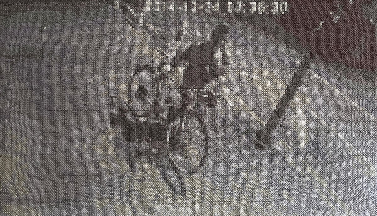
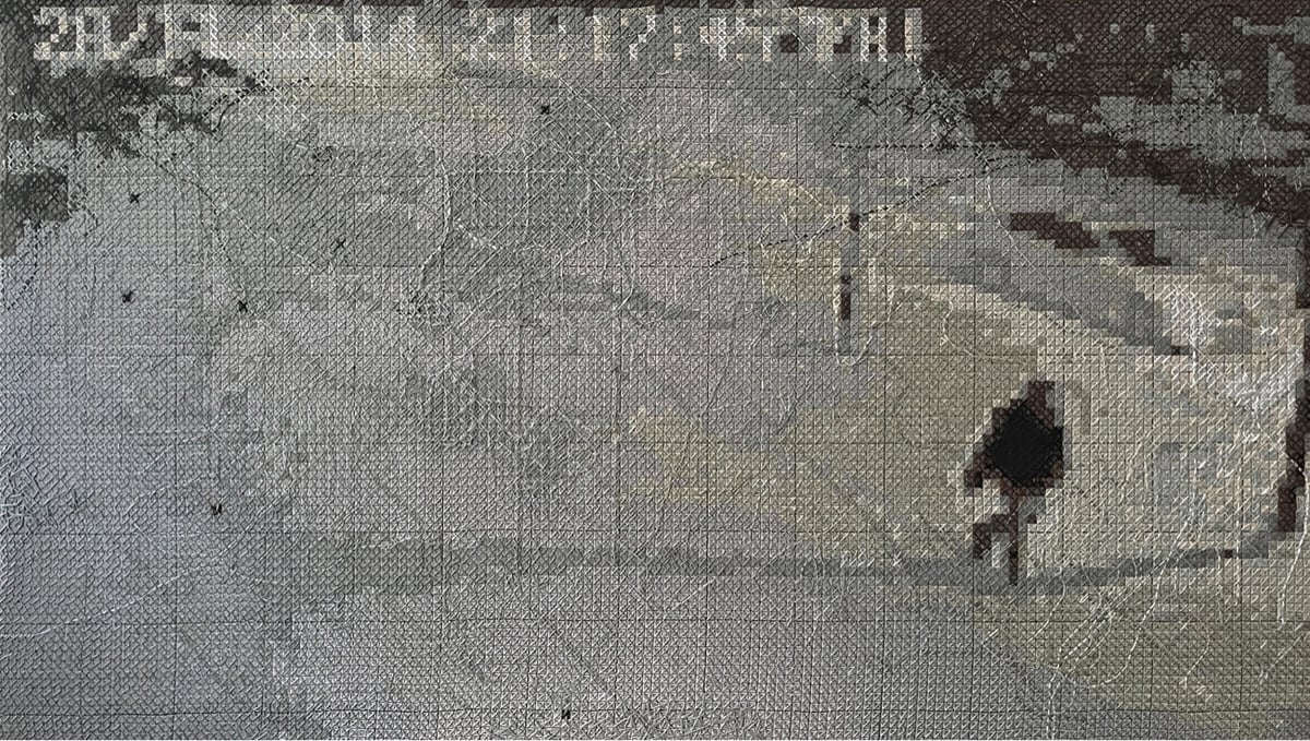
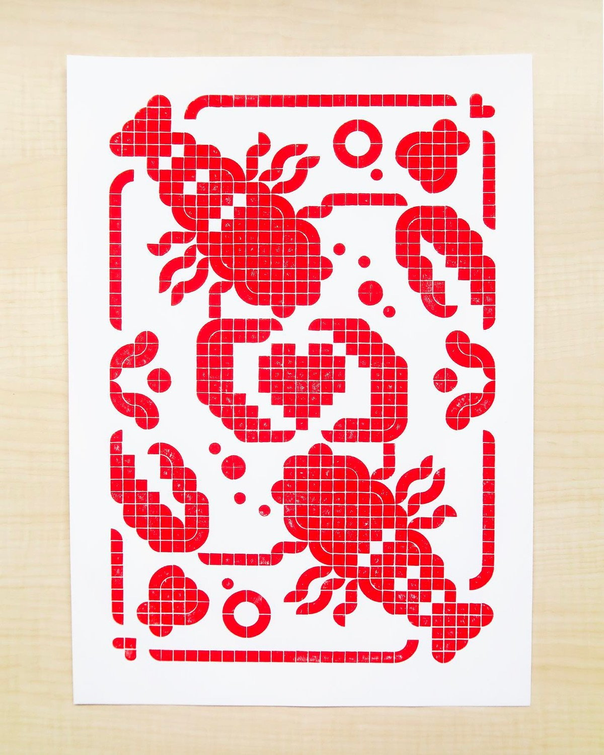
Oh man, I don’t think this could be any more in my wheelhouse: cross-stitch embroideries of CCTV camera images by Francine LeClercq. I’ve always had a soft spot for cross-stitch — it’s the ur-pixel art — and to see low-res, compressed, B&W security camera footage done in embroidery is just a real treat. There’s not much on LeClercq’s site about the work, but check out these posts at Colossal and designboom for more information and photos.
This is wonderful: a collection of video clips of Charles Schulz drawing his iconic Peanuts comic strip — “everything I could find of Charles Schulz drawing his Peanuts characters” in the words of the compiler.
Unfortunately, I’m not highly educated. I’m merely a high school graduate. I studied art in a correspondence course because I was afraid to go to art school. I couldn’t see myself sitting in a room where everyone else in the room could draw much better than I and this way I was protected by drawing at home and simply mailing my drawings in and having them criticized.
I wish I had a better education but I think that my entire background made me well-suited for what I do. If I could write better than I can, perhaps I would have tried to become a novelist and I might have become a failure. If I could draw better than I can, I might have tried to become an illustrator or an artist and would have failed there. But my entire being seems to be just right for being a cartoonist.
Charles Schulz: Unbothered. Moisturized. Happy. In his lane. Focused. Flourishing.
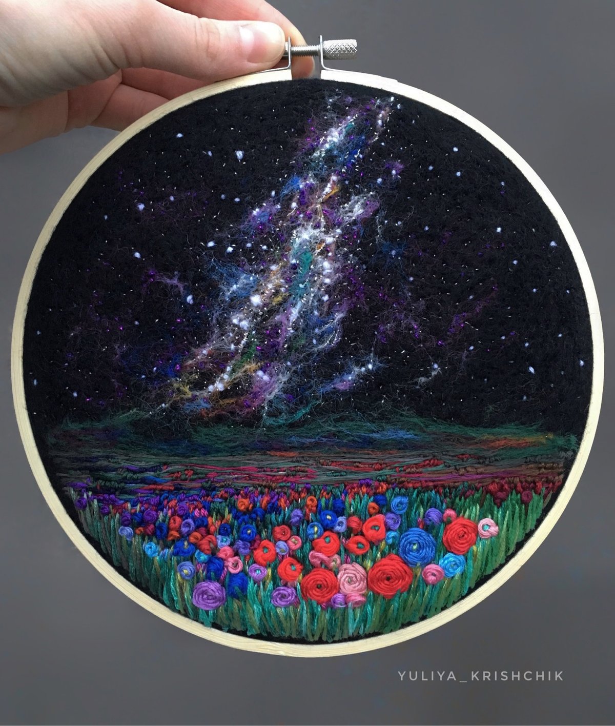
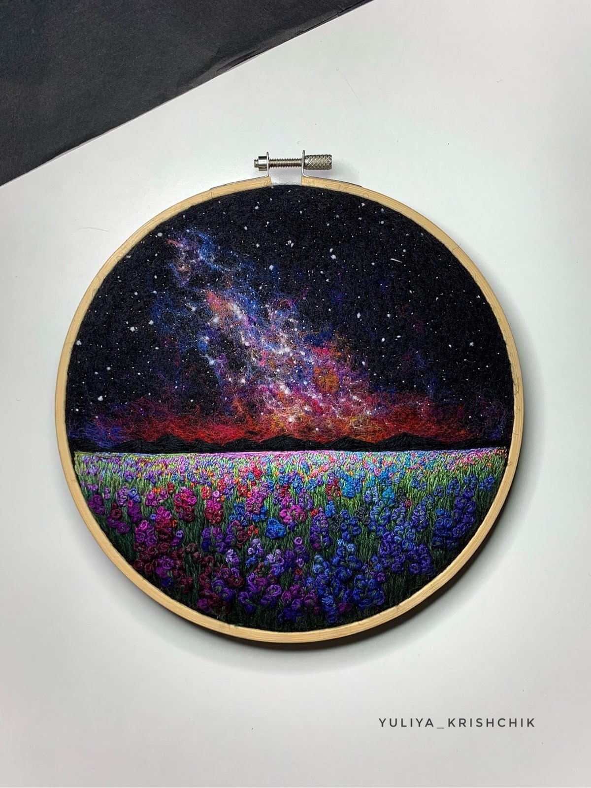
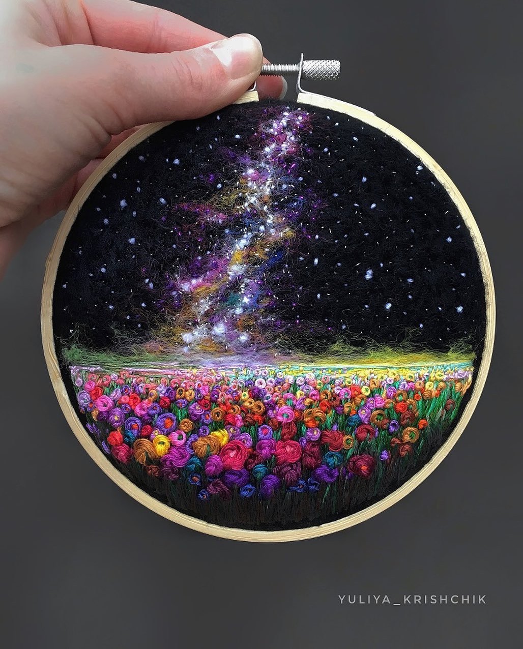
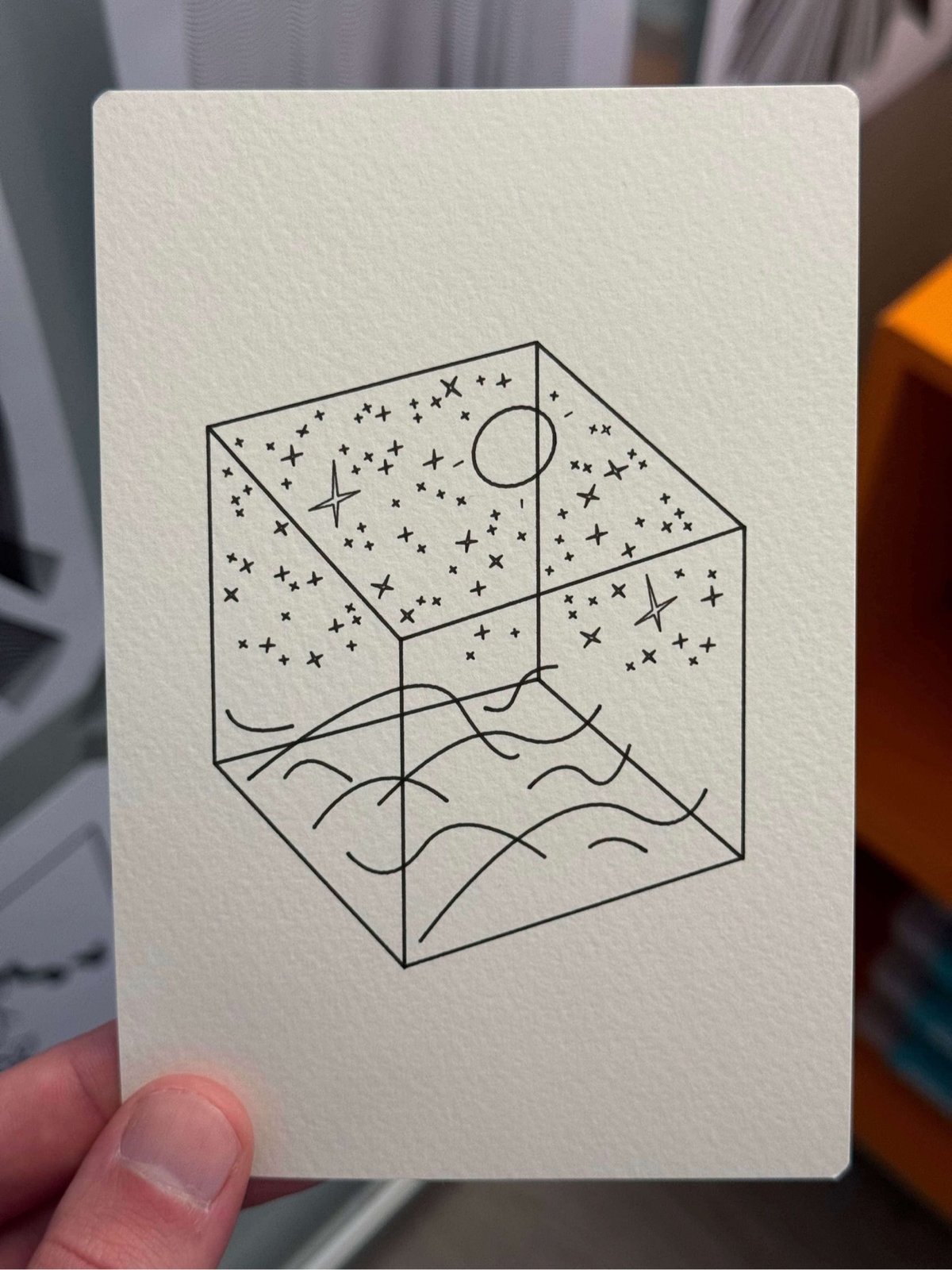
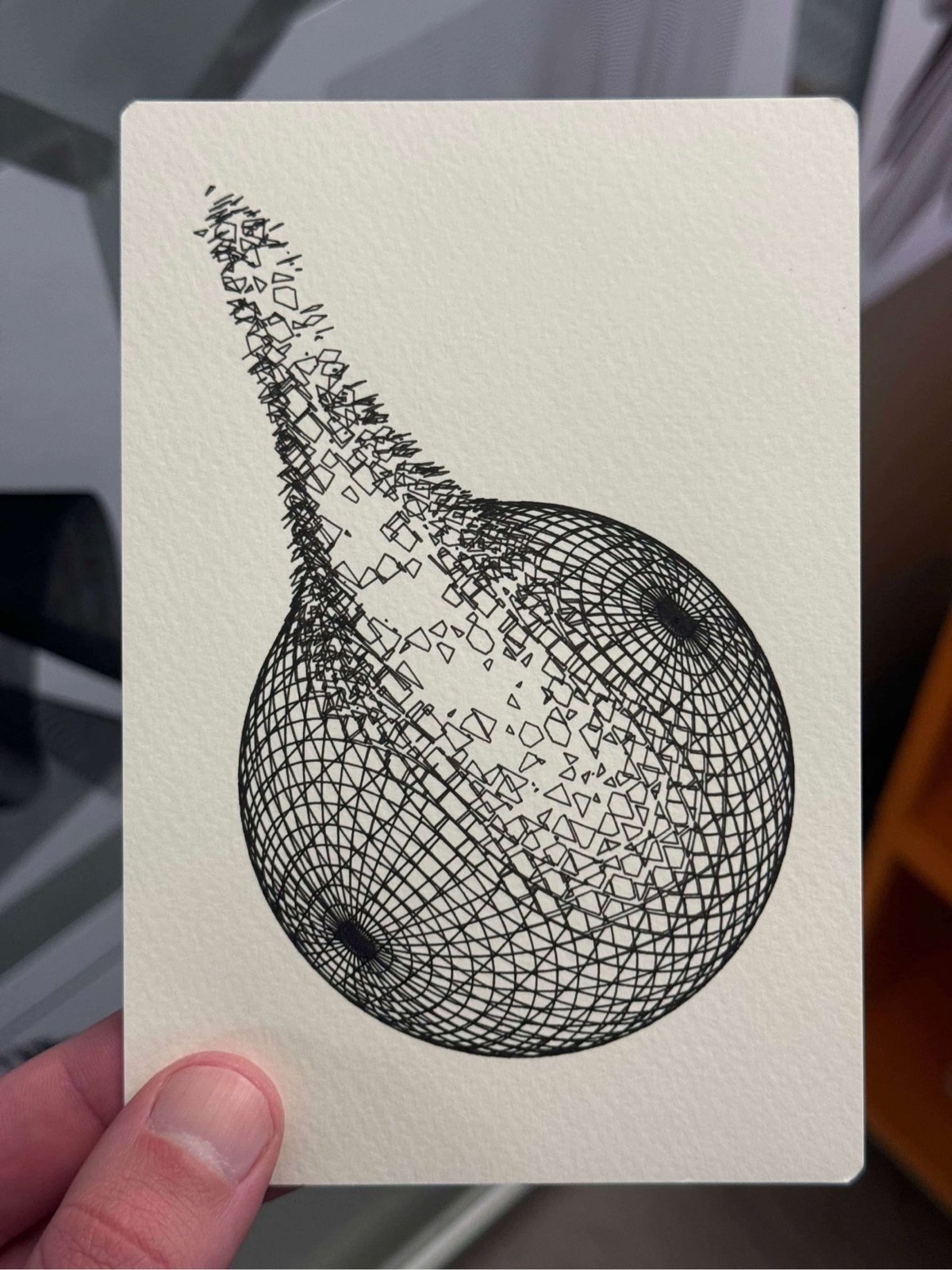
I love Yuliya Krishchik’s space-themed embroidery pieces, especially the ones featuring Milky Way-like star fields — she calls them “surreal space landscapes”. If you watch one of Krishchik’s videos, you can see that her pieces are just a bit 3D…a cool effect.
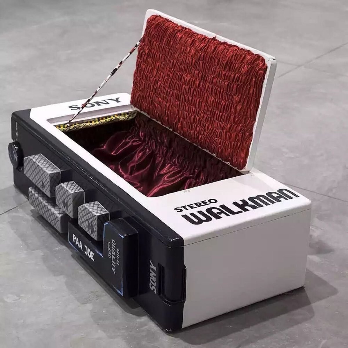
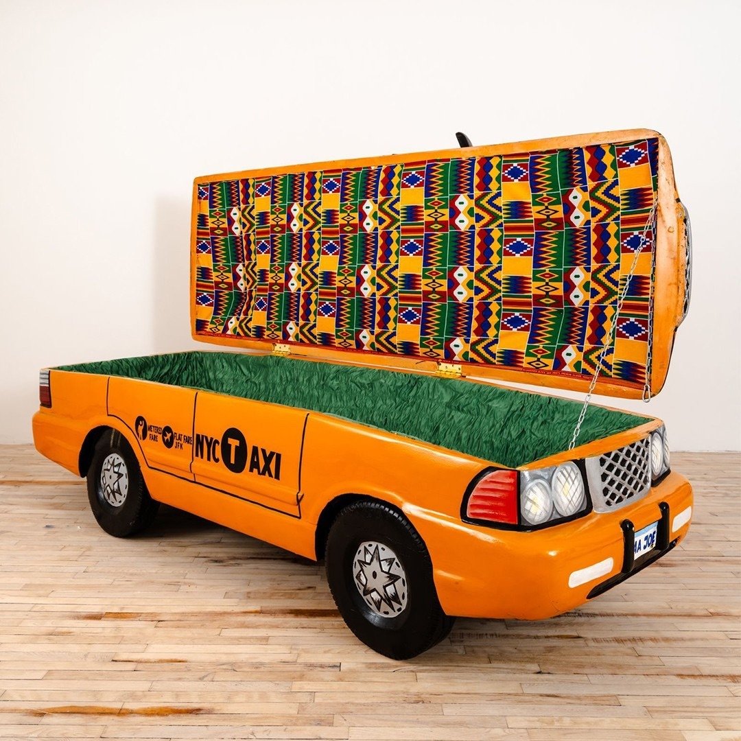
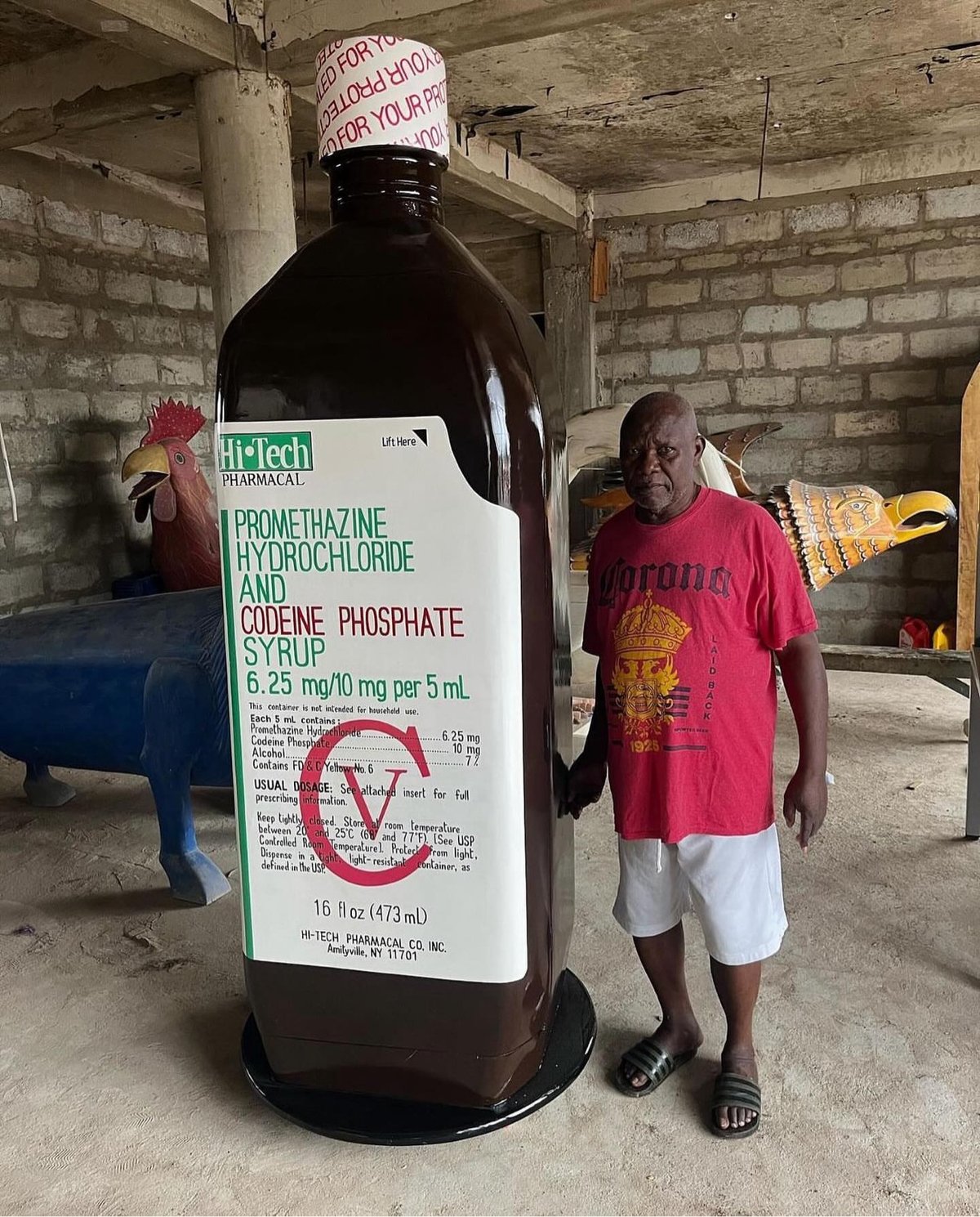
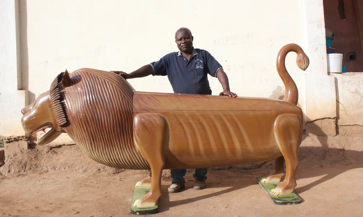
Ghanaian sculptor Paa Joe makes coffins (both human-sized and mini sculptures) modeled after real-life objects that were important to the deceased. He just opened his first NYC solo show at Superhouse; from their description of his work:
Paa Joe is a second-generation fantasy coffin maker, contributing to an artistic tradition of great importance around Ghana’s capital, Accra. Known as abeduu adeka, or proverb boxes, these end-of-life vessels illustrate Ghanaian beliefs concerning life and death. Since the 1960s, the artist has meticulously carved and painted figurative coffins, representing various living and inanimate objects symbolizing the deceased (an onion for a farmer, an eagle for a community leader, a sardine for a fisherman, etc.).
You read more about Paa Joe’s work and see more of his pieces at The Guardian:
“People celebrate death in Ghana. At a funeral, we have a passion for the person leaving us - there are a lot of people, and a lot of noise,” says Jacob, 28, who has worked with his father for eight years.
Far from seeing their work as morbid, Jacob says the coffins are celebratory and reflect west African attitudes to death. “It reminds people that life continues after death, that when someone dies they will go on in the afterlife, so it is important that they go in style.”
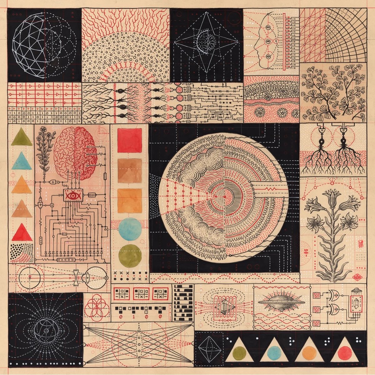
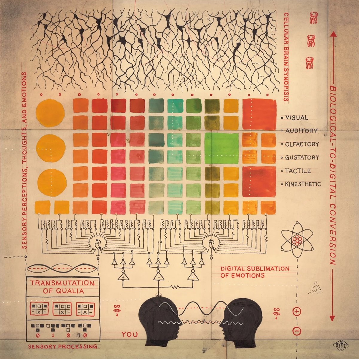
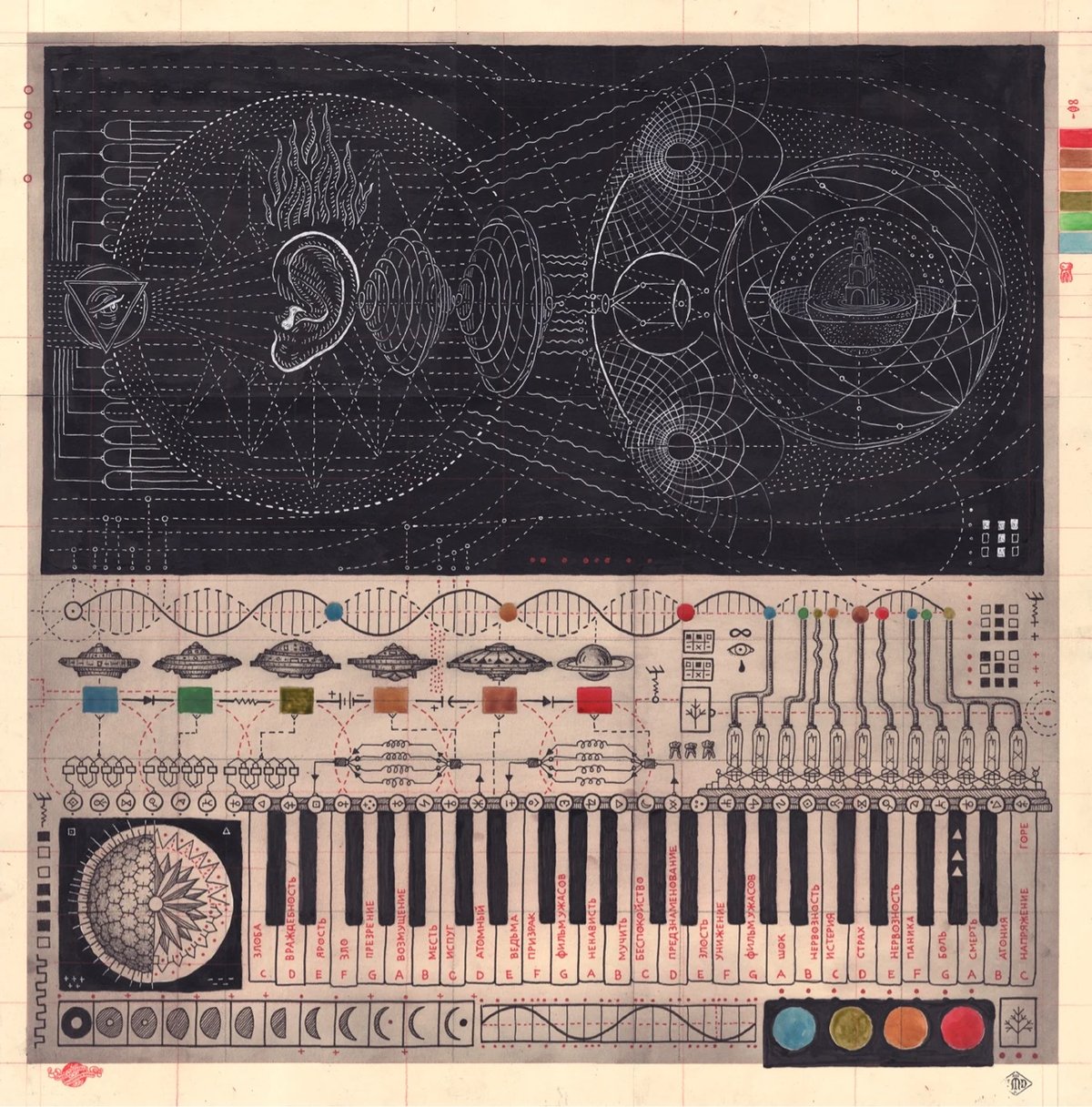
I have to admit that the illustration style of Daniel Martin Diaz is not completely my cup of tea, but I do like a few of his pieces (like those pictured above). They have an infographic quality that’s quite compelling — and also remind me a bit of Chris Ware, by way of Hilma af Klint and, uh, Edward Gorey maybe?
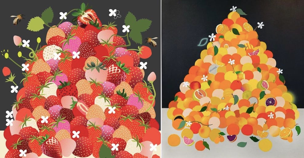
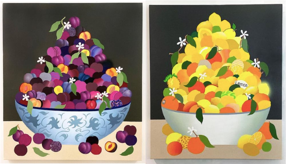
I recently discovered the “pile of fruit”-themed art of Stephen D’Onofrio. I love it! The strawberries are a preliminary sketch, but they’re what drew me in, and the rest are paintings. He’s represented by Dallas’s Galleri Urbane. I also like his “trees fitting exactly in the canvas” paintings.
This is a fun ad for the 2024 AICP Awards about the pitfalls of focus-grouping & corporatizing art, featuring an annoyed van Gogh (“How can a painting fail?”) and an even more annoyed Frida Kahlo. (via noah kalina)
Of special interest is the discussion of fabricating and transposing the artist’s rendering or model into mosaic, glass, or metal, the materials that can survive in the transit environment.
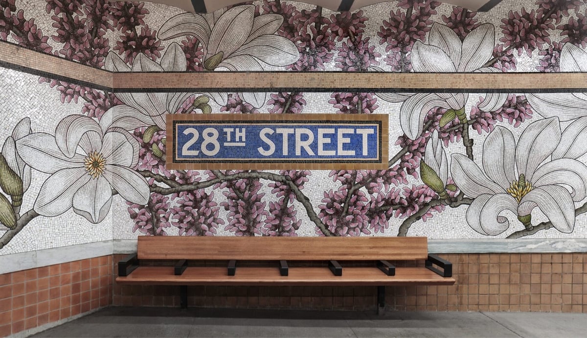
Nancy Blum’s piece at the 28th Street station (top, above) is my favorite piece in the entire subway system; I love it so much. (via colossal)
If a genie granted me the ability to bring one artist back from the dead to create a portrait of myself or a loved one, without thinking too hard about what it might mean for the artist (“you brought me back for what?!”), I’d pick John Singer Sargent. I’m curious about which artists come to mind for others, if anyone wants to chime in.
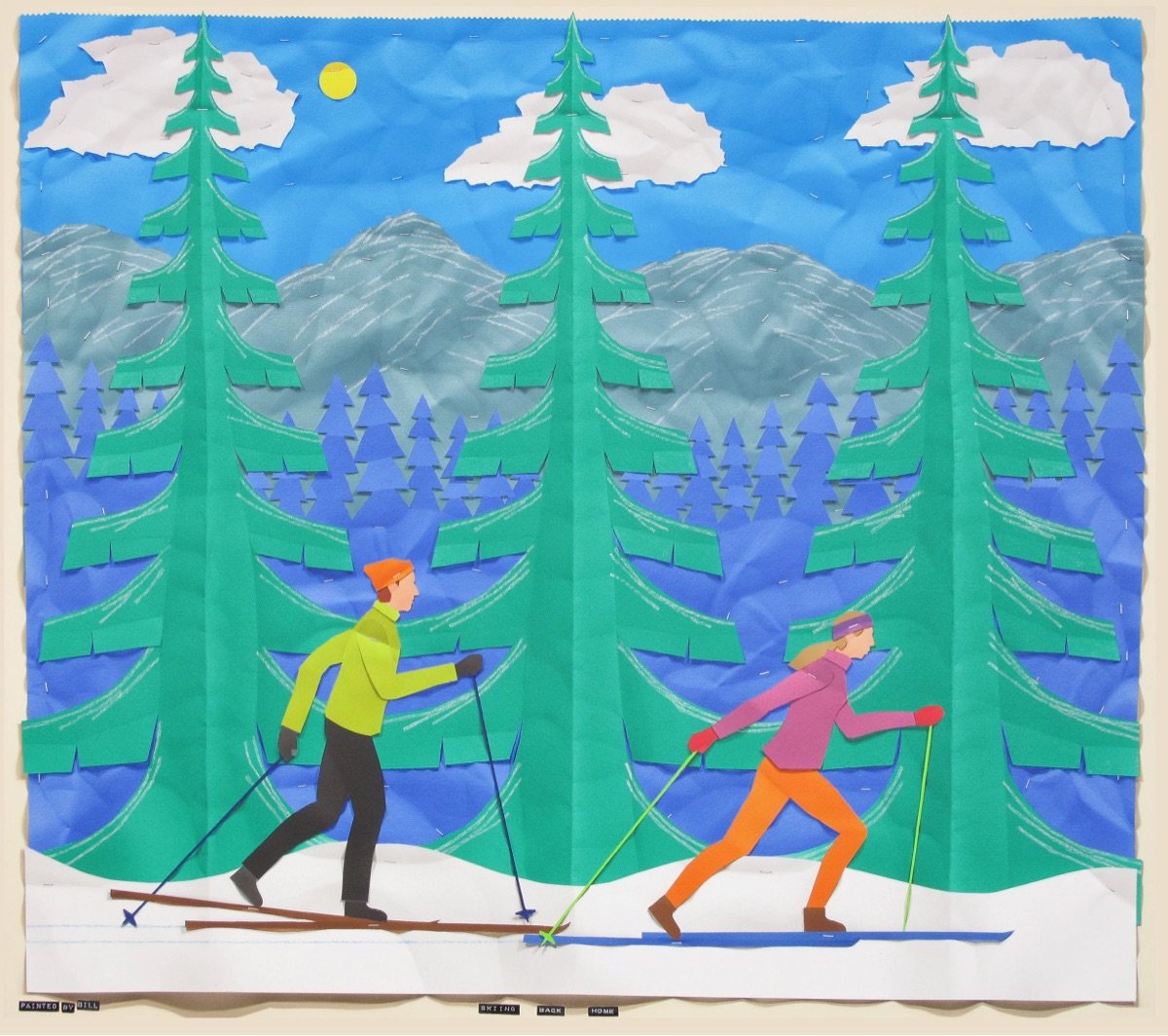
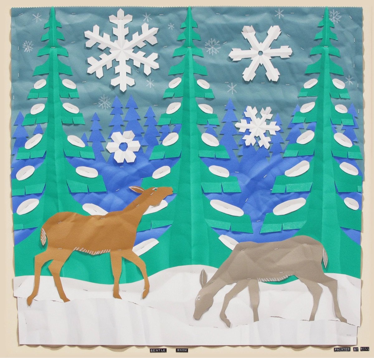
Bill Braun is a “trompe l’oeil painter” who creates paintings that look like paper craft, complete with visible paper folds, shadows, and even the “staples” holding the “paper” to the backing. What an incredible illusion. And I always enjoy an artist who is reticent to give an artist statement or explain their work:
I don’t like to give an artist statement because it undoes the premise of my work, trompe l’oeil painting. Literally from the French, trompe l’oeil means “trick the eye”. An artist’s statement might undo the fundamental aim of convincing the viewer, at least for a moment, that what he sees are actual objects and not a painting. The basic rules of trompe l’oeil painting are that objects are rendered in real scale, and totally within a shallow painted space. This type of painting has always been a minor branch of realist painting, but with a very long history. The Athenian painters Xeuxis and Parrhasios in 5th century B.C. (as told by Pliny the Elder in his Natural History) and Roman murals of the 2nd century A.D., 16th century Dutch vanitas painting and the 19th century Philadelphia School painters, Harnett, Peto and Haberle, are examples. Today there are still trompe l’oeil painters around; I am happy to be one of them.
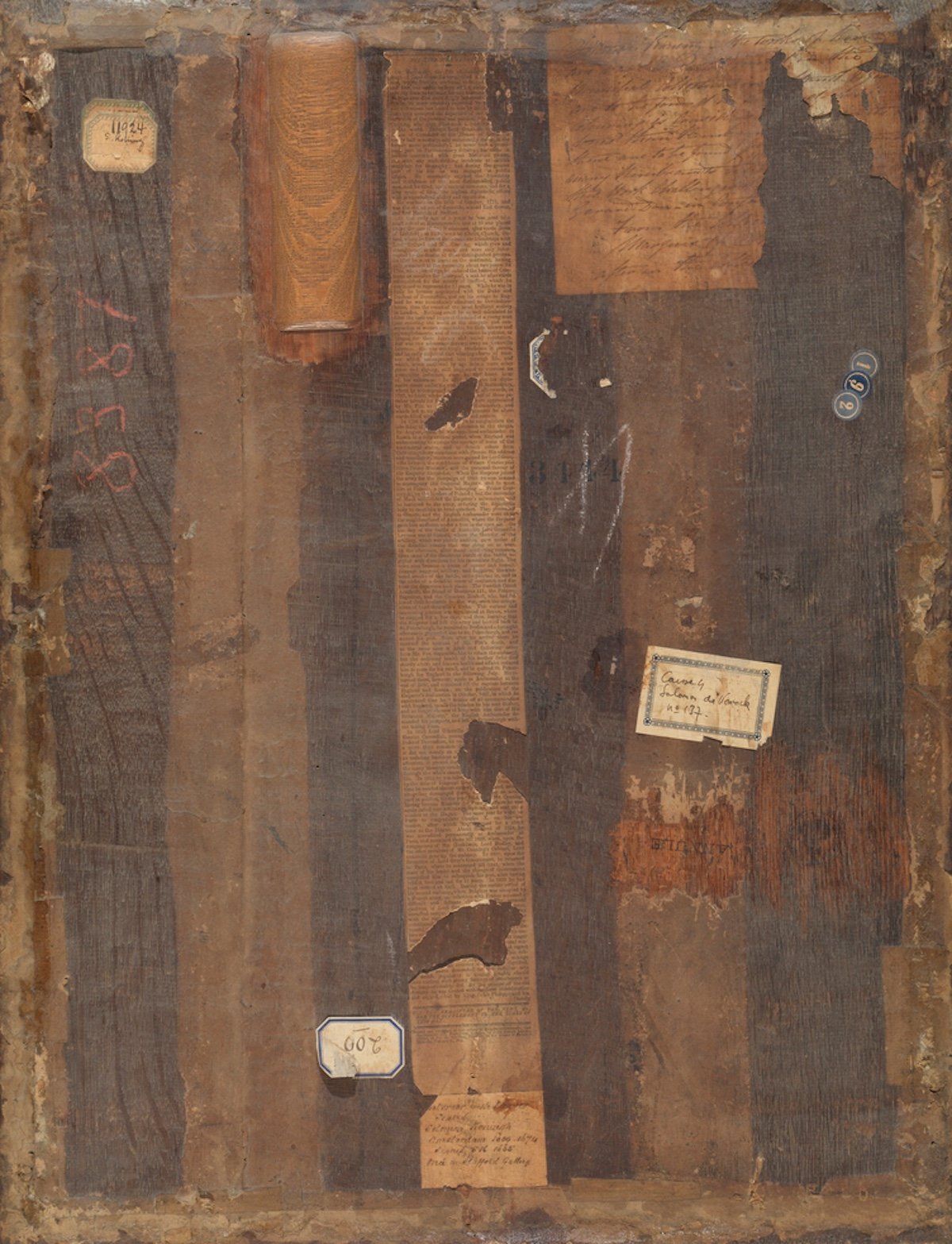
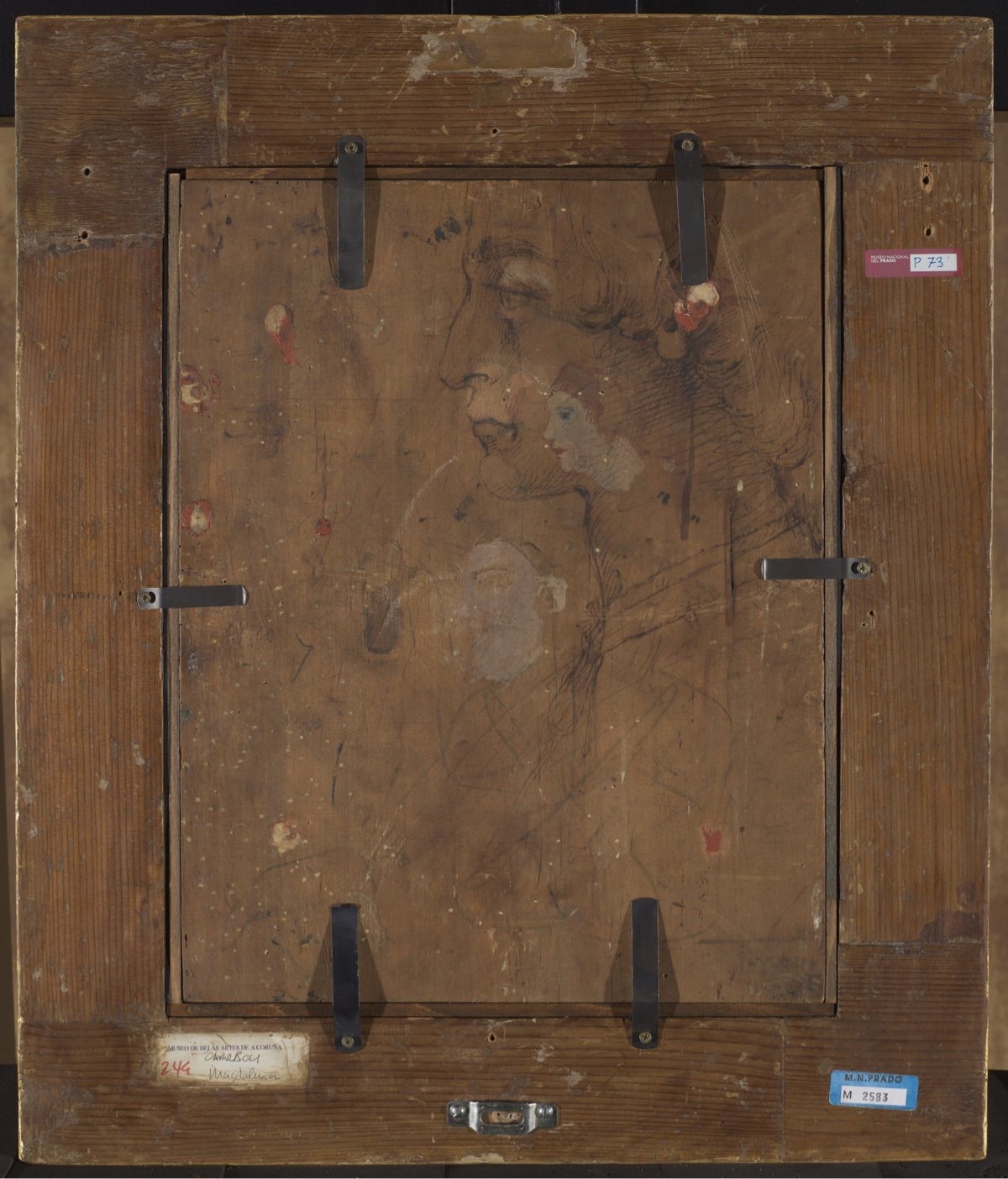
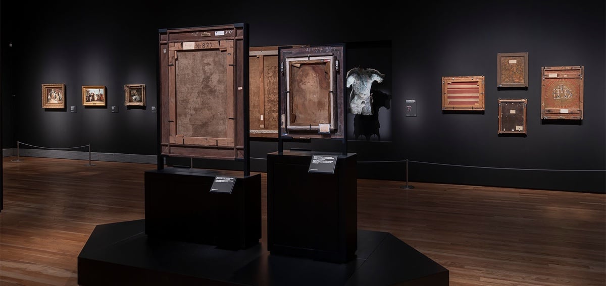
Madrid’s Museo Nacional del Prado recently put on an exhibition called On the Reverse that featured the backs of notable works of art.
This exhibition goes beyond the simple action of turning paintings around. Rather, the Museo del Prado is undertaking a complete reassessment of the backs of works in its collections while also identifying relevant examples in other major museums which reveal how appreciation of works of art is enhanced when we do more than just look at the front. The exhibition addresses issues that have never previously been brought together and in which there is also space for imaginative interpretations: the emergence of the reverse as a pictorial motif in two sub-genres: the self-portrait of the artist behind the canvas and the depiction of the picture back in trompe l’oeil; the poetic reading of the stretcher as a cross; two-sided paintings; the back as a field for experimentation and subjective expression; aesthetic appreciation of the material nature of the works, and the issue of the viewer seen from behind, which makes us aware of the particular spatial relationships that are generated by human interaction with art.
I once went with an artist friend to an art museum where they hung some of the paintings so you could see both sides of them at once, and she was often more interested in seeing the backs, where you could maybe see who owned the painting previously, etc.
This is an image created by Hal Lasko in Microsoft Paint:
Lasko was a retired graphic designer & typographer who found a new passion when he received a computer for his 85th birthday, which came preloaded with Microsoft Paint. This short film tells the story of The Pixel Painter:
That all changed for Hal when his family gave him a computer as an 85th birthday present. His new PC came loaded with Microsoft Paint software, a program developed in the 1980’s. The program is more kitsch than cutting edge, but it’s easy interface and pixel precision allowed Hal to journey down a new artistic path with a style many consider “retro cool”.
In his last year of life, he had his first solo gallery show, spoke at a conference and was featured in a Super Bowl commercial. He passed away just shy of his 99th birthday in 2014, leaving us with a legacy that passion knows no age, and for Hal, the proof of that is surely in the pixels.
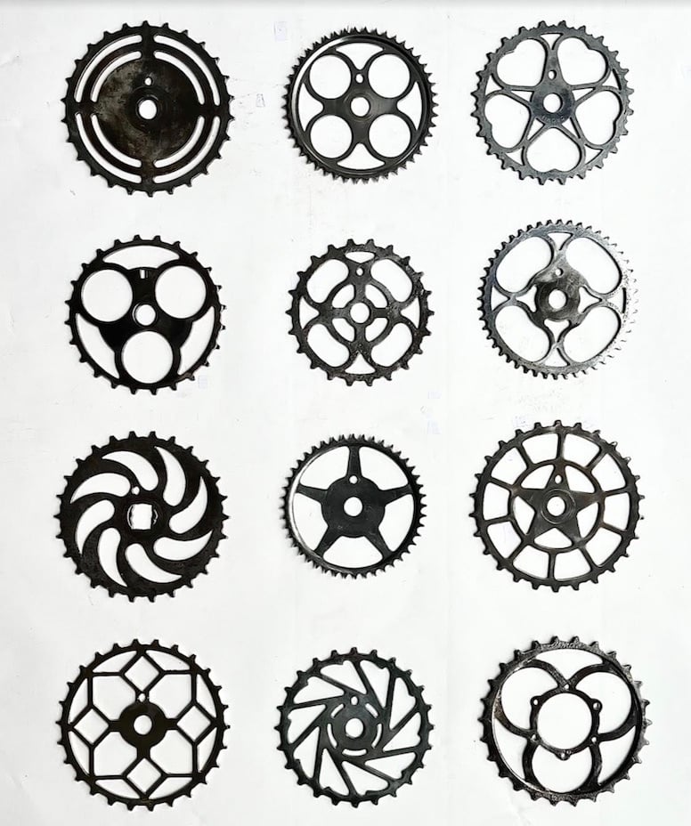
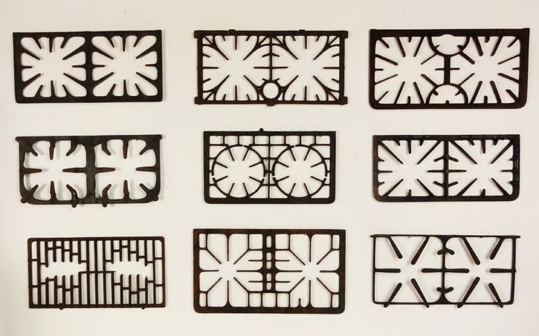
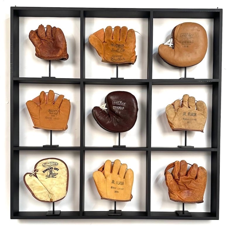
Lost Found Art is a design company that “specializes in sculptural installations and assemblages using antique and vintage pieces”. Their collections are fun to browse through and remind me of the work of Bernd and Hilla Becher.
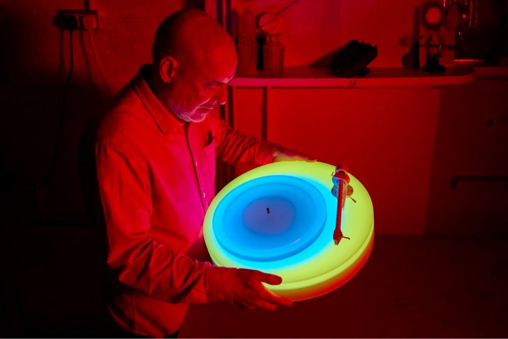
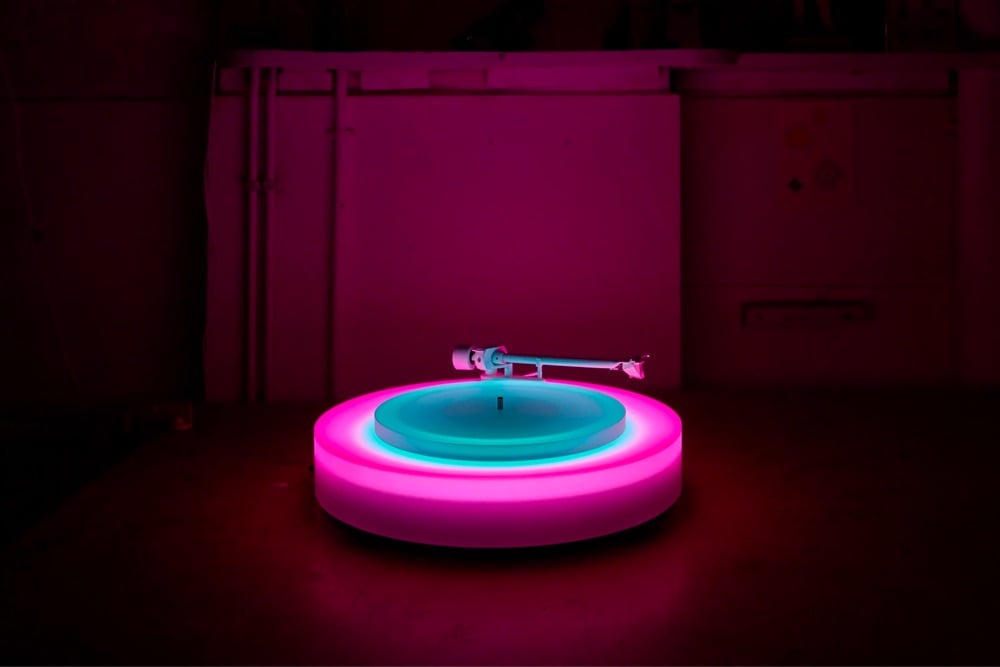
Brian Eno’s Turntable II is made up of a platter and base, which change colours independently, seamlessly phasing through combinations of generative ‘colourscapes’. The pattern of lights, the speed at which they change and how they change are programmed, but programmed to change randomly and slowly. It plays both 33 and 45rpm vinyl.
Only 150 will be sold and they’re £20,000 so hopefully you’ll see one in a museum someday. (via kevin kelly)
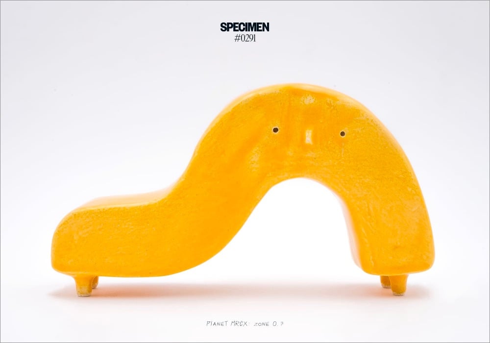
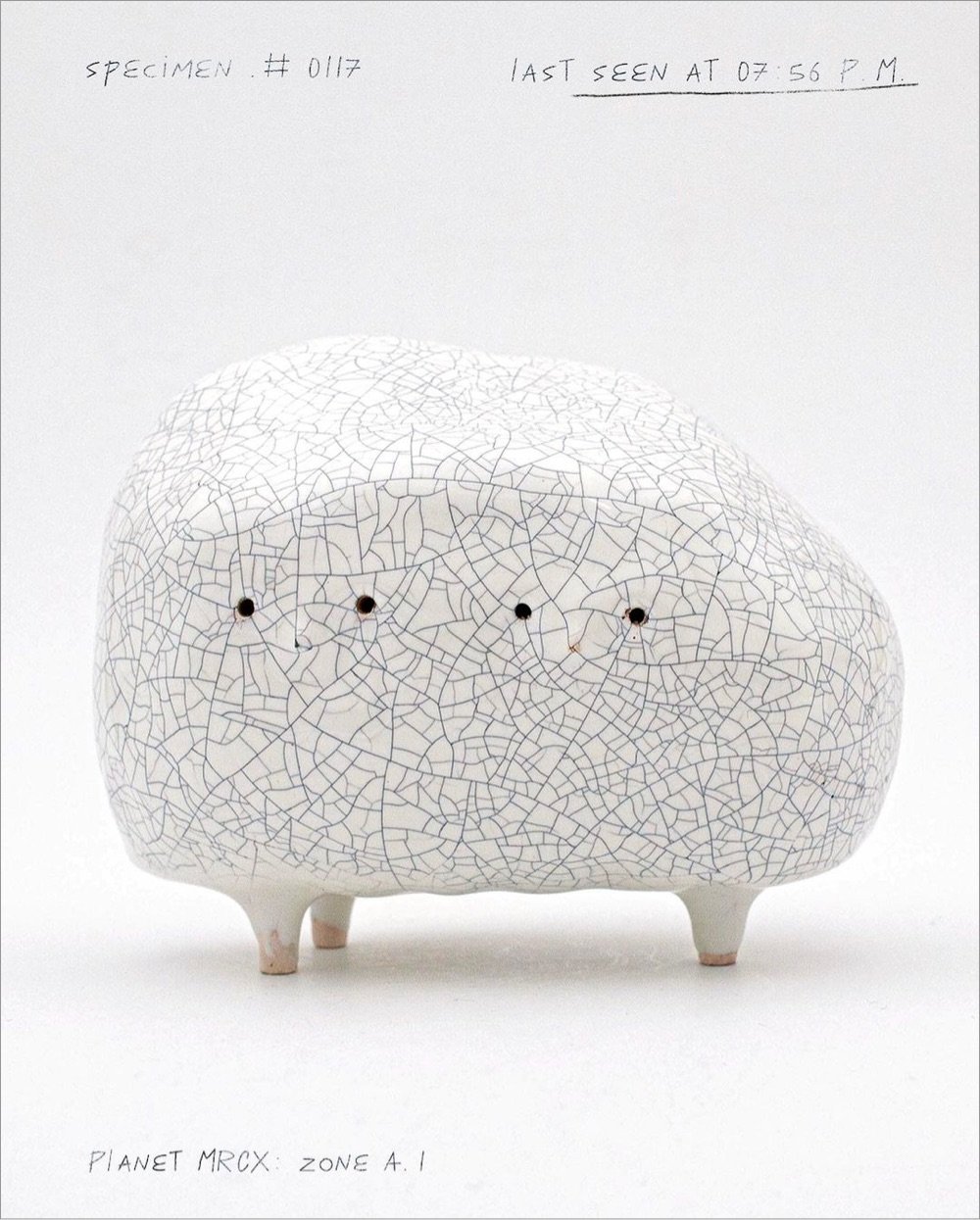
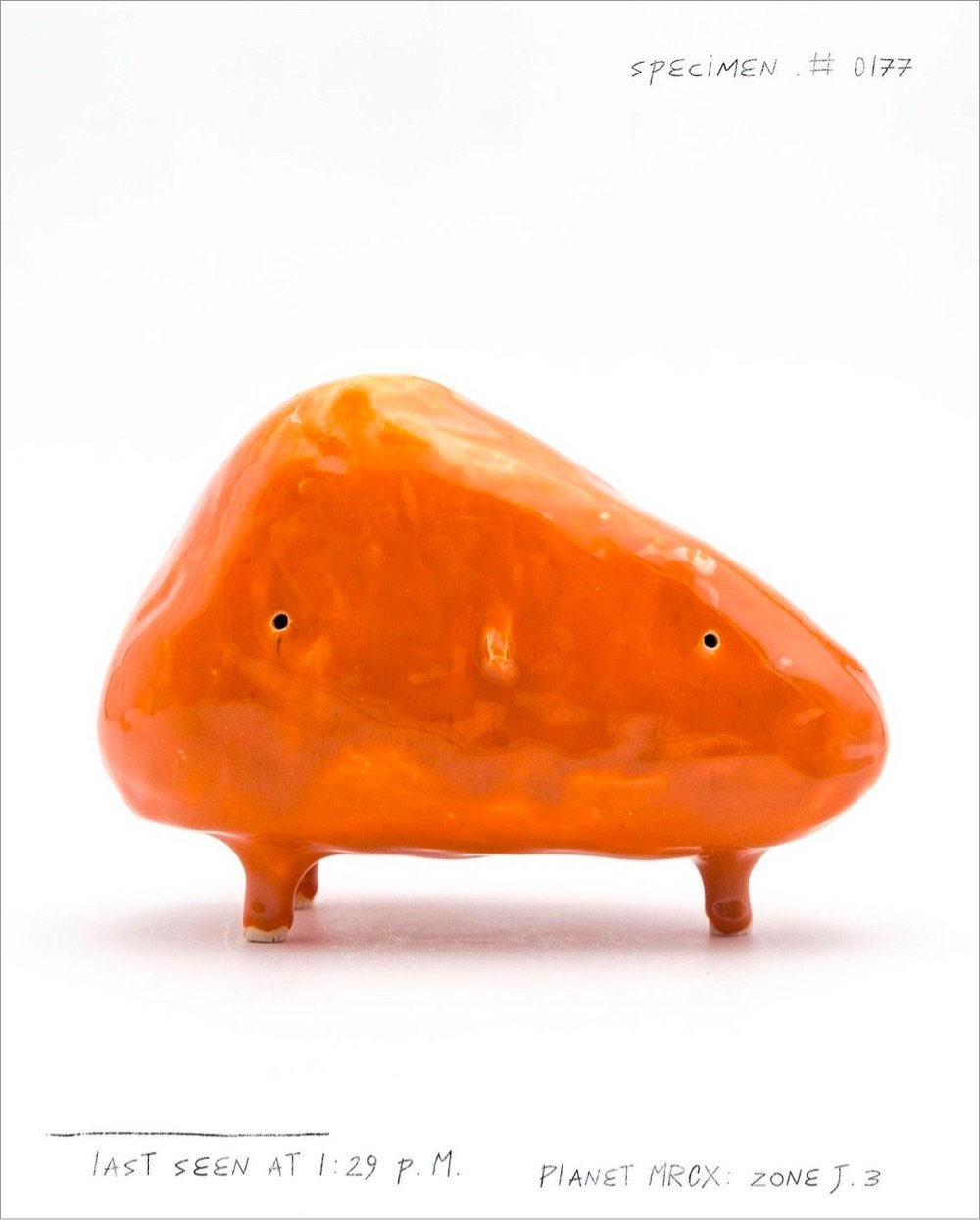
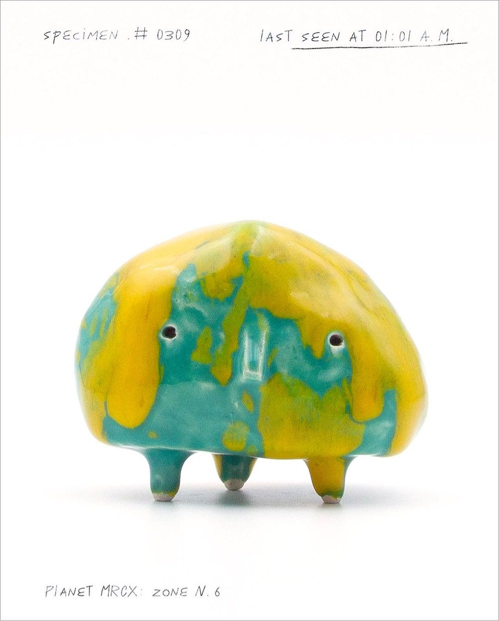
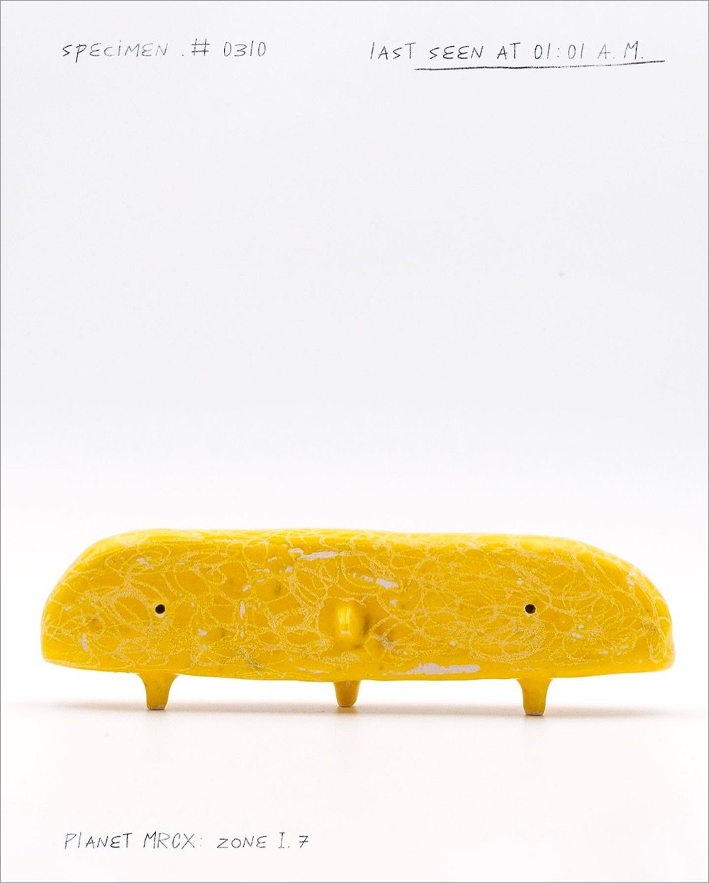
Ceramic artist Monsieur Cailloux makes these cute little ceramic creatures that are members of the Cailloux tribe “straight from the stone planet MRCX”. I like these little creatures, but whatever you think of them, you gotta admire this guy’s commitment to the bit. (via colossal)
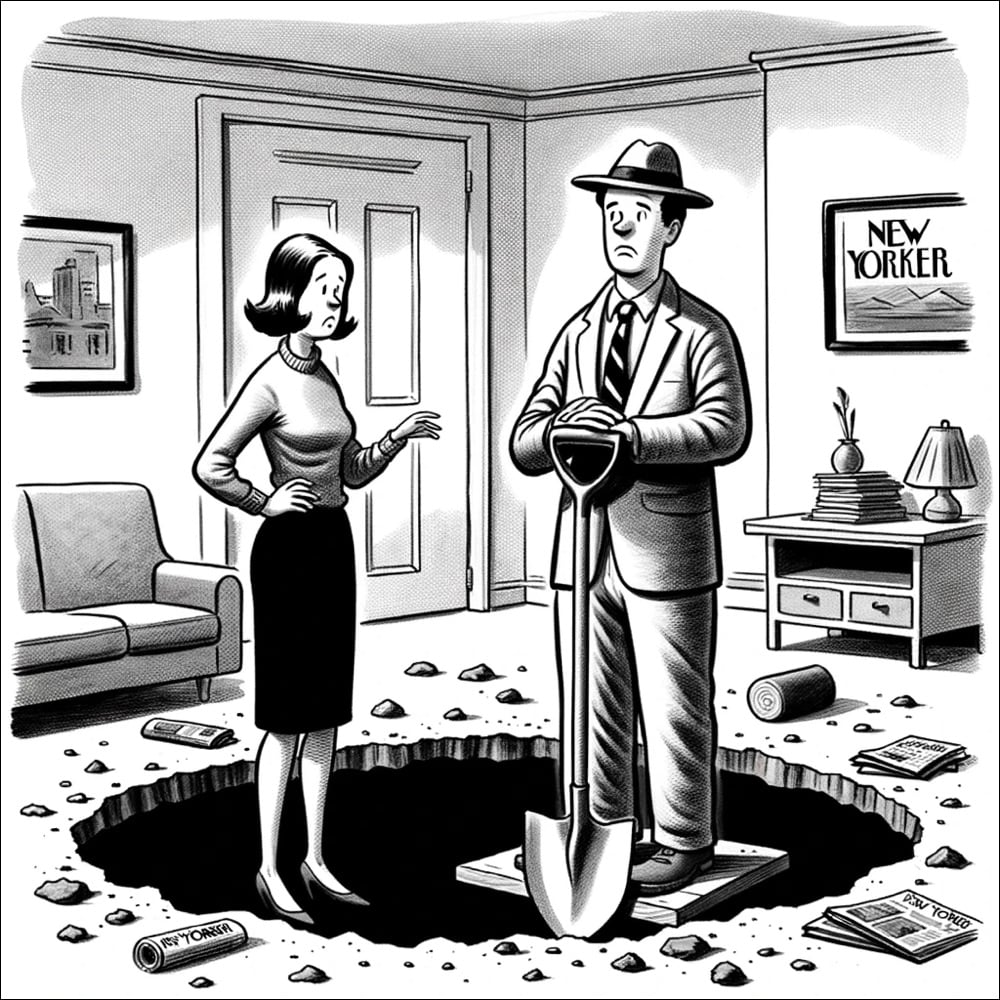
In June 2021 (pre The Bear), New Yorker cartoonist Zoe Si coached Ayo Edebiri through the process of drawing a New Yorker cartoon. The catch: neither of them could see the other’s work in progress. Super entertaining.
I don’t know about you, but Si’s initial description of the cartoon reminded me of an LLM prompt:
So the cartoon is two people in their apartment. One person has dug a hole in the floor, and he is standing in the hole and his head’s poking out. And the other person is kneeling on the floor beside the hole, kind of like looking at him in a concerned manner. There’ll be like a couch in the background just to signify that they’re in a house.
Just for funsies, I asked ChatGPT to generate a New Yorker-style cartoon using that prompt. Here’s what it came up with:
Oh boy. And then I asked it for a funny caption and it hit me with: “I said I wanted more ‘open space’ in the living room, not an ‘open pit’!” Oof. ChatGPT, don’t quit your day job!
For the Atlantic, Bianca Bosker writes about a trove of paintings supposedly by Jean-Michel Basquiat that were discovered in a storage locker, ended up in a museum, and then seized by the FBI as fakes. As the owner of a pretty-convincing-but-probably-fake Basquiat purchased at a Mexico City flea market (that is also painted on cardboard), I read this story with great interest.
Science promises to be a neutral and exacting judge, though in reality forensics aren’t always much help either. Technical analysis can rule out an artwork — pieces from the trove of purported Pollocks with which Mangan was involved were exposed as forgeries after researchers found pigments that postdated the artist’s life — but it can’t rule it in as definitively by the artist in question. Some forgers will submit their handiwork for forensic testing so they can see what flags their pieces as counterfeit, then adjust their methods accordingly. Scientific techniques are also far less useful for contemporary artists like Basquiat, who relied on materials that are still available and for which the margin of error on many tests is wide. When the collector in Norway sent a painting he’d purchased from Barzman to be carbon-dated, the test revealed that the cardboard could be from either the 1950s or the 1990s.
What does it matter if art is authentic?
Our obsession with artworks’ authenticity can in part be traced back to what’s known as the “law of contagion”: Pieces are thought to acquire a special essence when touched by the artist’s hand. Yet the intense distaste for forgeries reveals a dirty secret about our relationship with art, which is that we tend to fixate on genius and authorship more than the aesthetic qualities of the work we claim to value so highly. The writer Arthur Koestler, in an essay on snobbery, goes so far as to argue that when judging a work, who made it should be considered “entirely extraneous to the issue.” What matters more, he argues, is what meets the eye.
When I see art in person or visit historic places, I often think to myself that I am standing where the artist or famous personage once stood — and it makes me feel something. I’m not sure if it has anything to do with magic though.
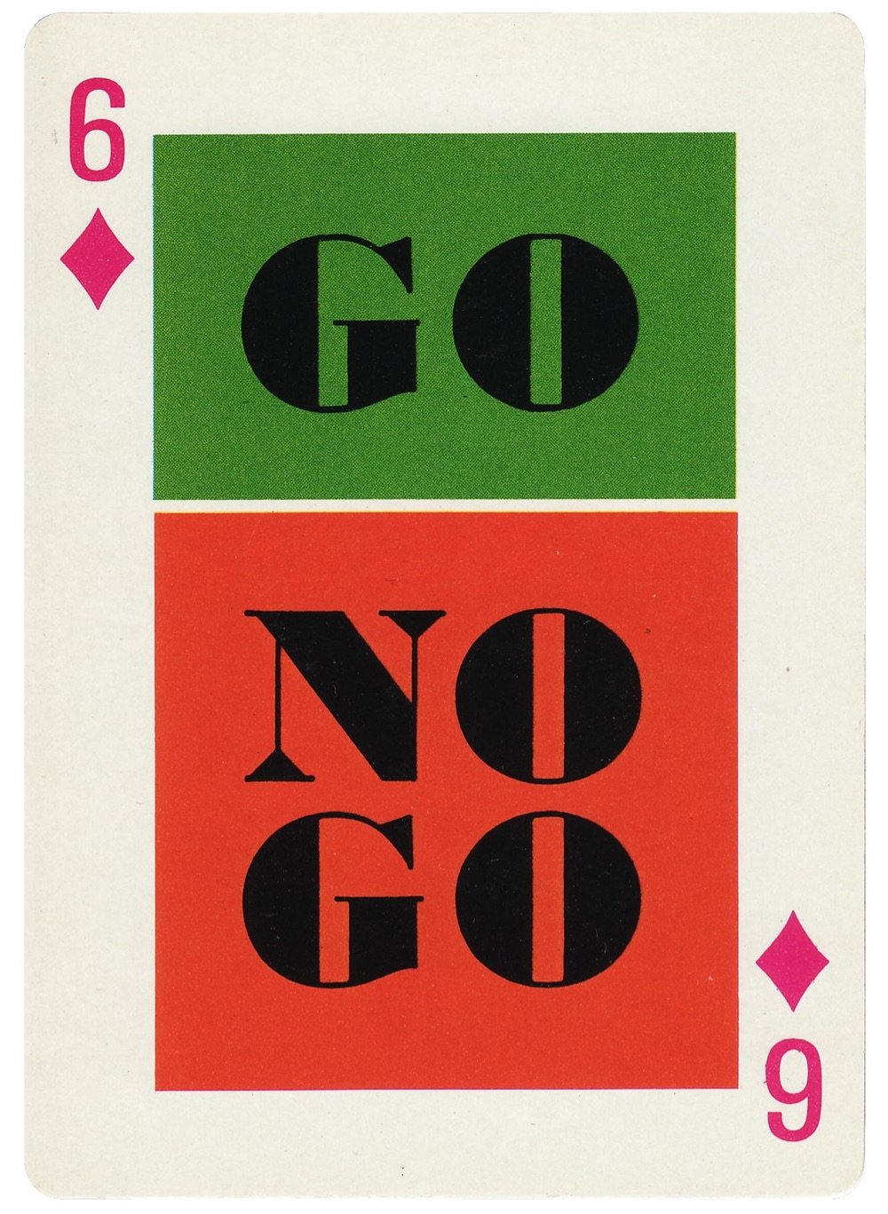
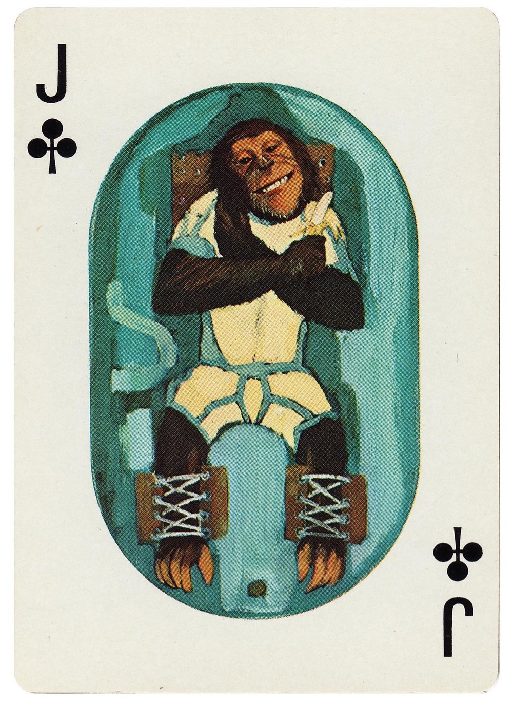
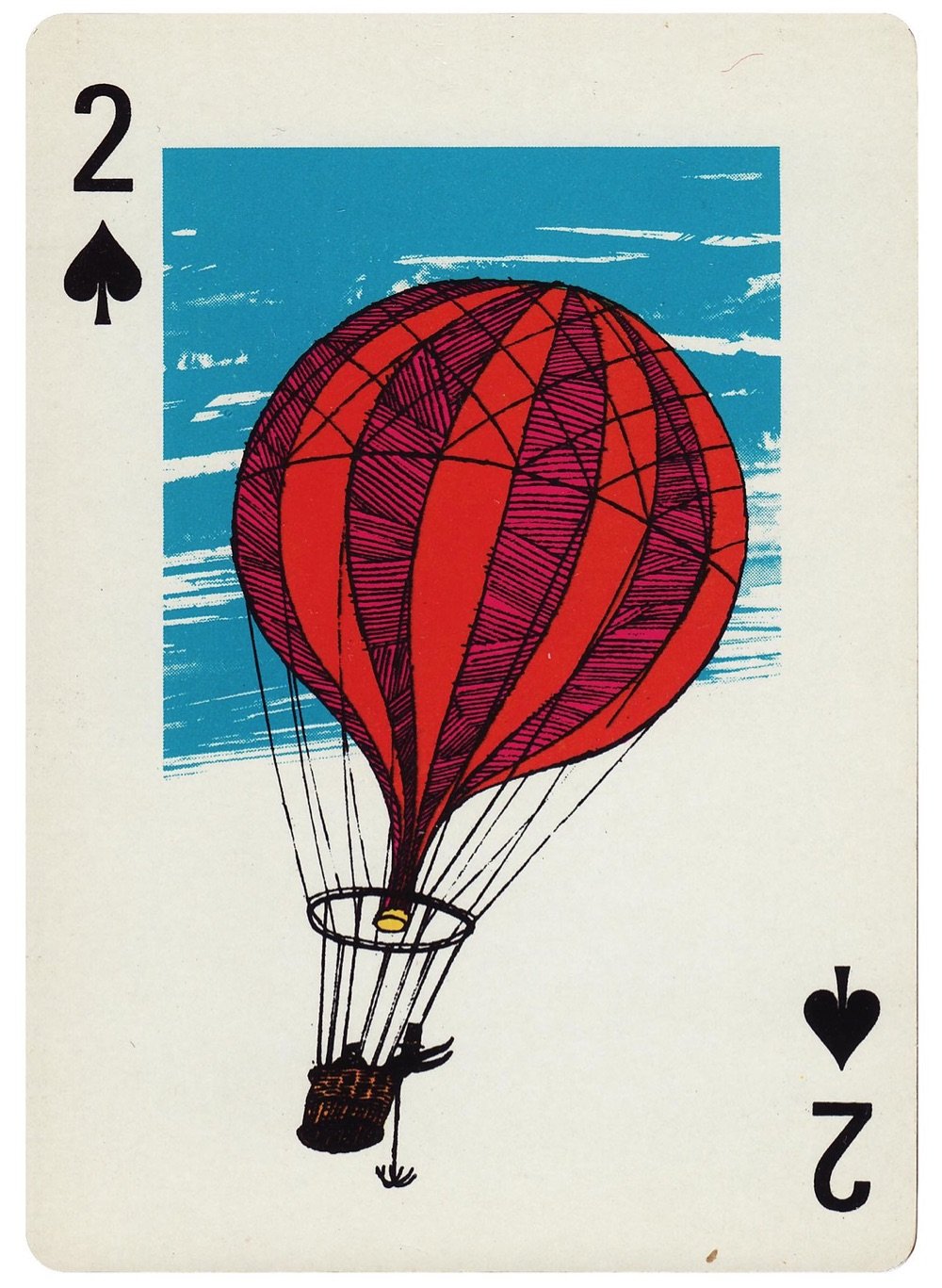
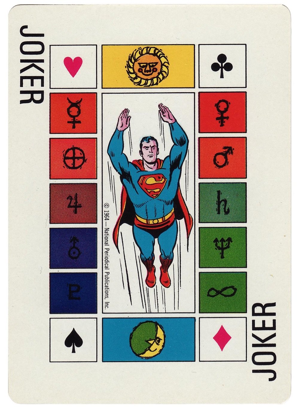
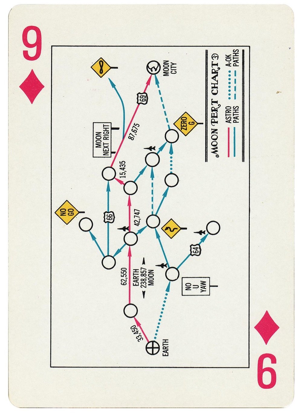
The General Dynamics Astronautics Space Cards were printed up in 1964 to celebrate the American space program. This Flickr account has scans of every card in the deck, including both jokers. Each suit corresponds to a different aspect of the program:
These space cards tell a story — the story of America’s man-in-space programs. The hearts deal with the human element, the clubs portray the sciences, the spades show products, and the diamonds depict modern aerospace management without which the other three elements could not be successful…
To Mr. Lignier, the parallel is obvious. “Digital and social media companies use the same concept to keep the attention of the viewer as long as possible,” he said.
Indeed, social media has been described as “a Skinner Box for the modern human,” doling out periodic, unpredictable rewards — a like, a follow, a promising romantic match — that keep us glued to our phones.
Or maybe being able to keep ourselves busy pressing buttons is its own reward. In a 2014 study, scientists concluded that many human volunteers “preferred to administer electric shocks to themselves instead of being left alone with their thoughts.” Maybe we would rather sit around and push whatever levers are in front of us — even those that might make us feel bad - than sit with ourselves in quiet contemplation.
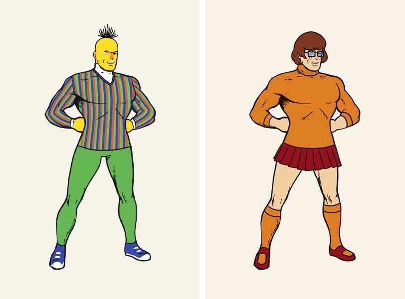
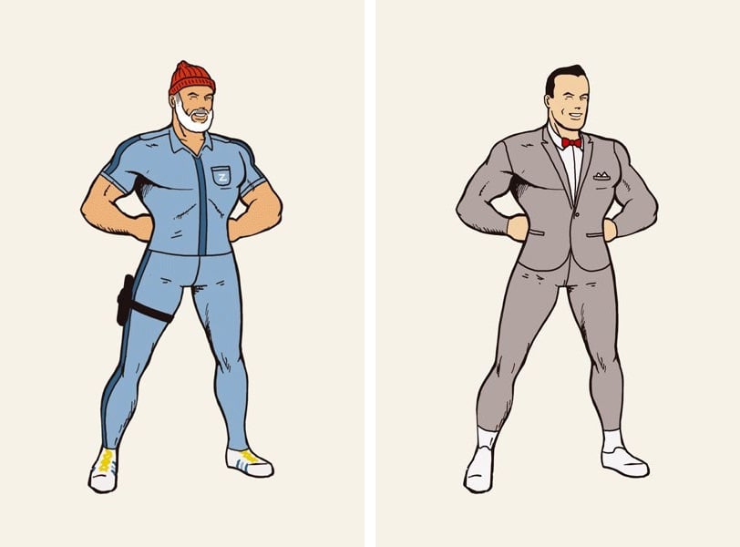
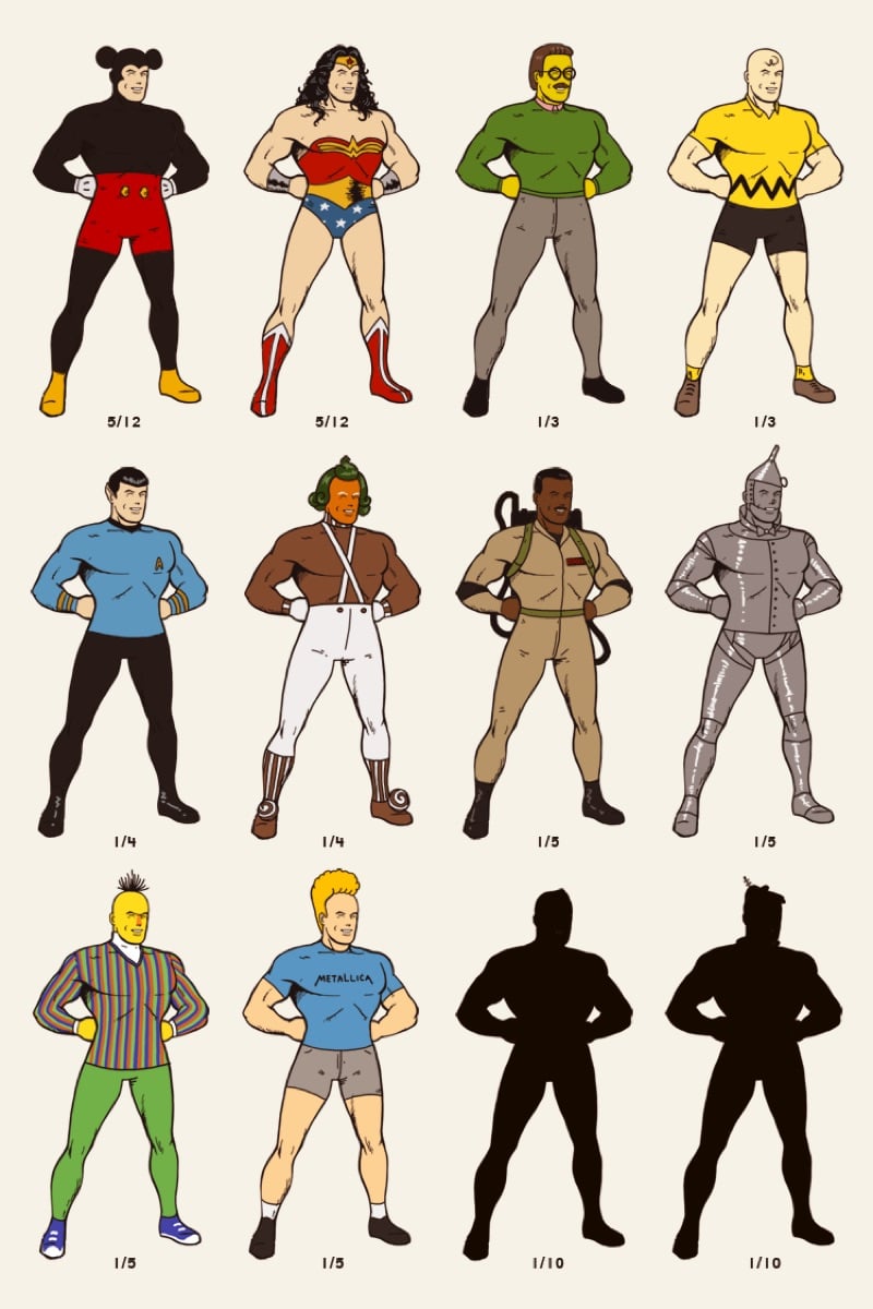
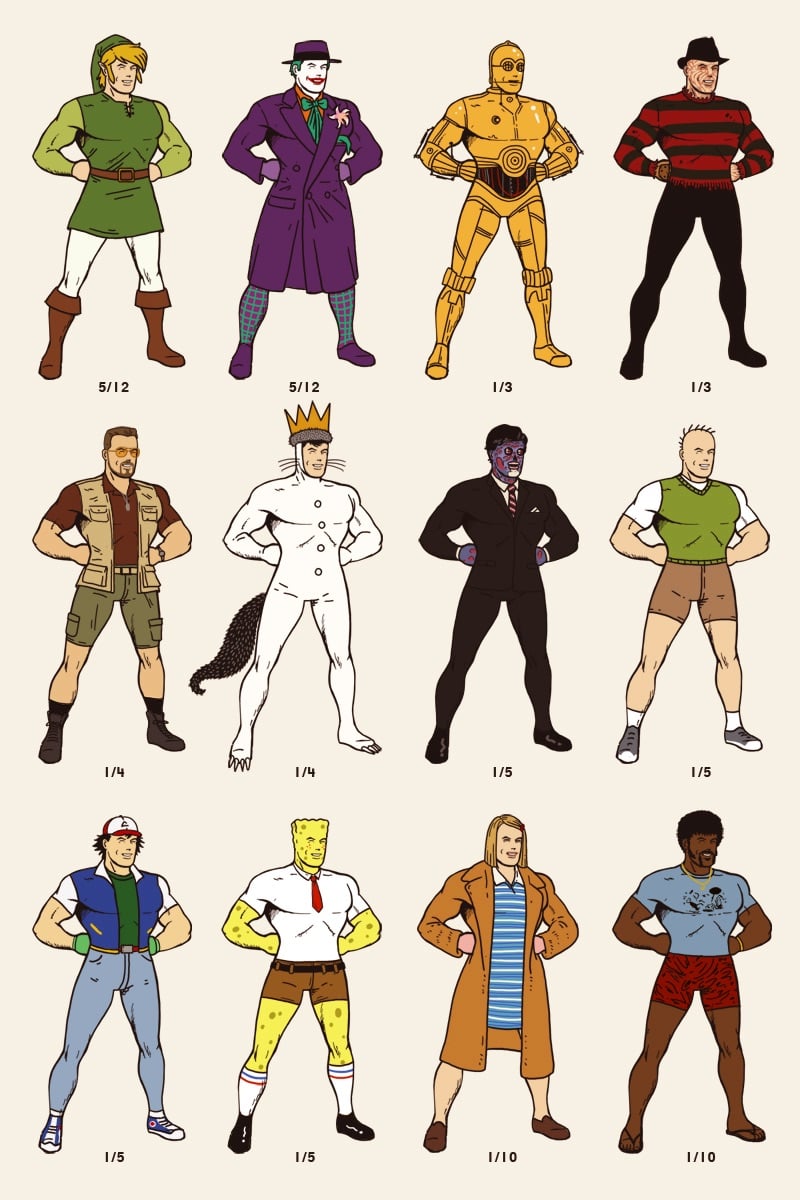
Using an iconic Superman pose, artist Mike Mitchell has translated all sorts of familiar characters onto that pose, including C-3PO, Velma from Scooby Doo, Charlie Brown, Ned Flanders, Pee-wee Herman, Bert from Sesame Street, Steve Zissou, and Spongebob Squarepants. Here’s an animation of all them. (via moss & fog)


Stay Connected