Ryan Gosling was on Saturday Night Live this weekend and they did a sequel to one of my favorite SNL sketches (which is completely dorky in a design nerd sort of way) ever: Papyrus. Behold, Papyrus 2:
Avatar spawned worlds, right? Every little leaf of every little flower, every little eyelash of every little creature: thoroughly thought out. But the logo: it’s Papyrus, in bold. Nobody cares. Does James Cameron care? I don’t think so.
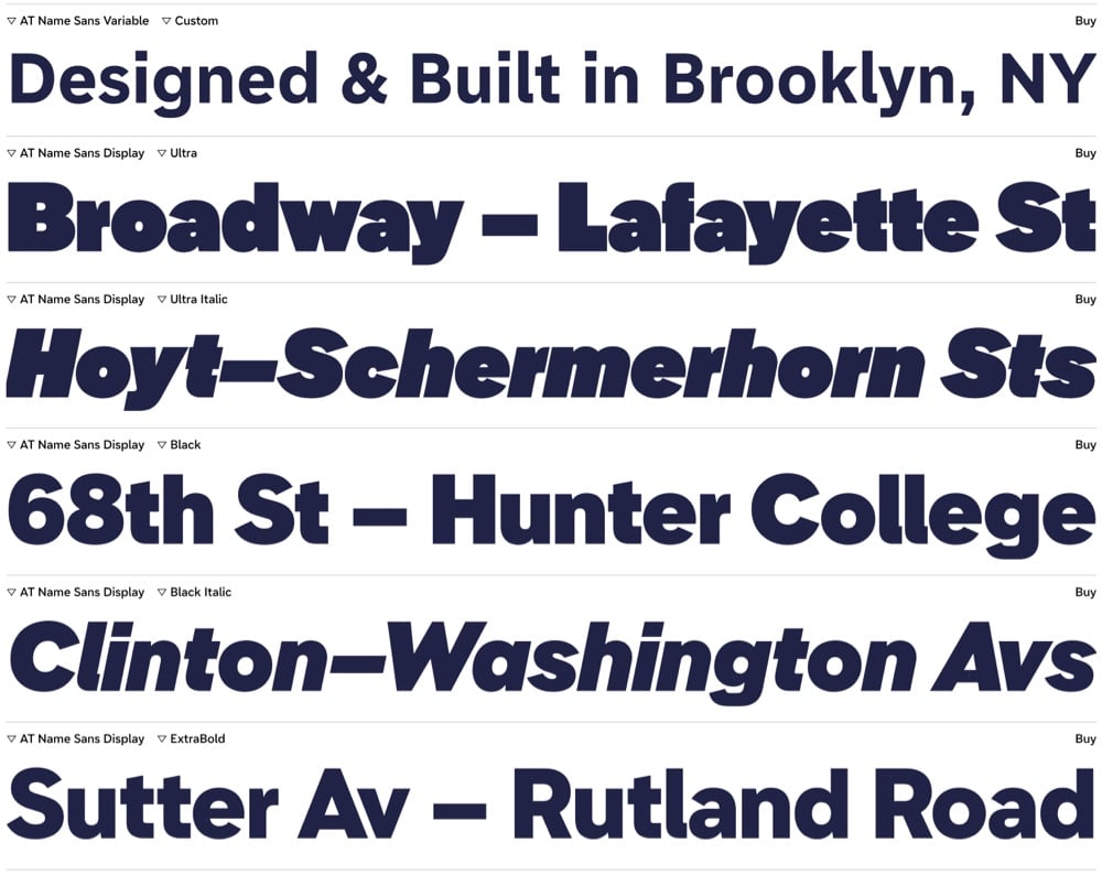
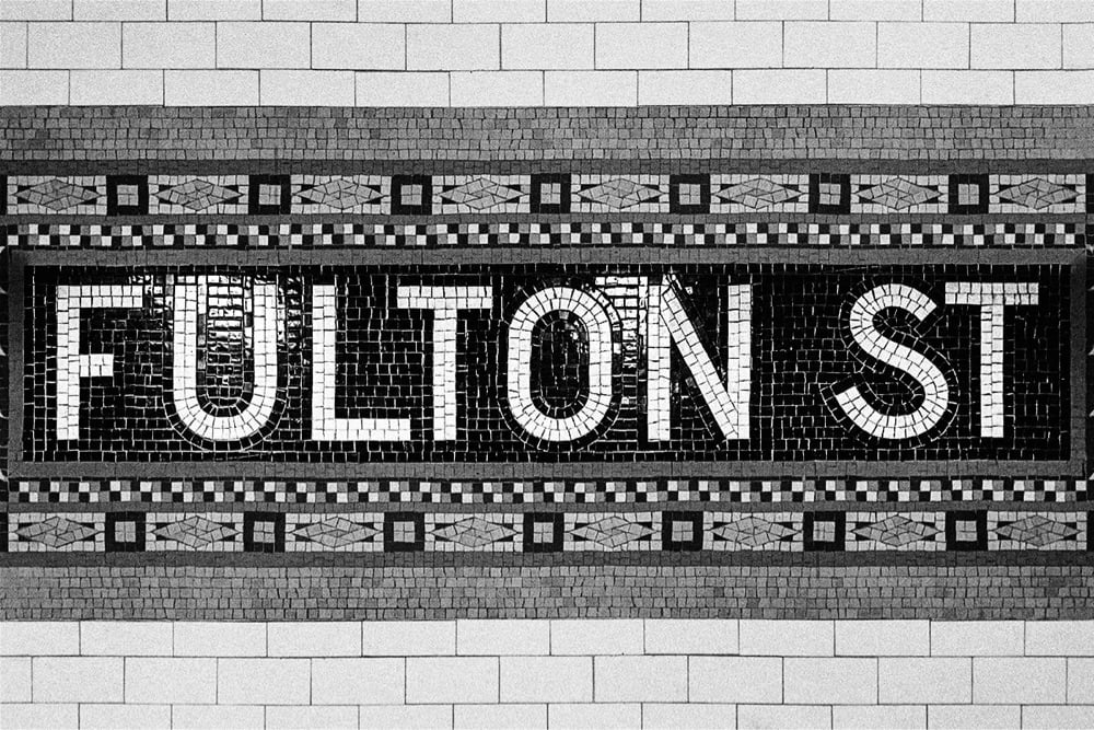
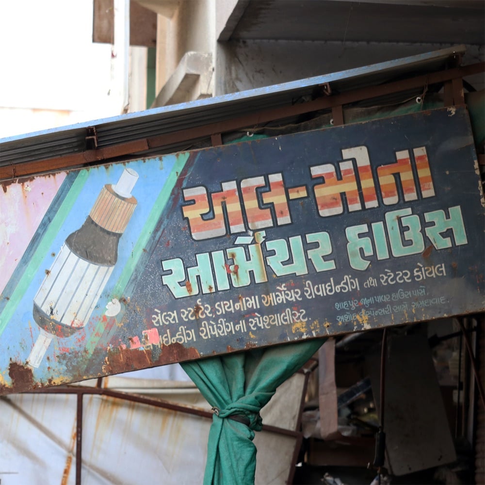
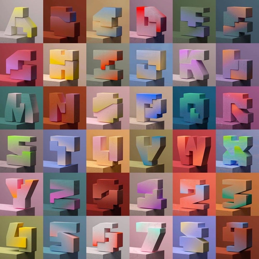
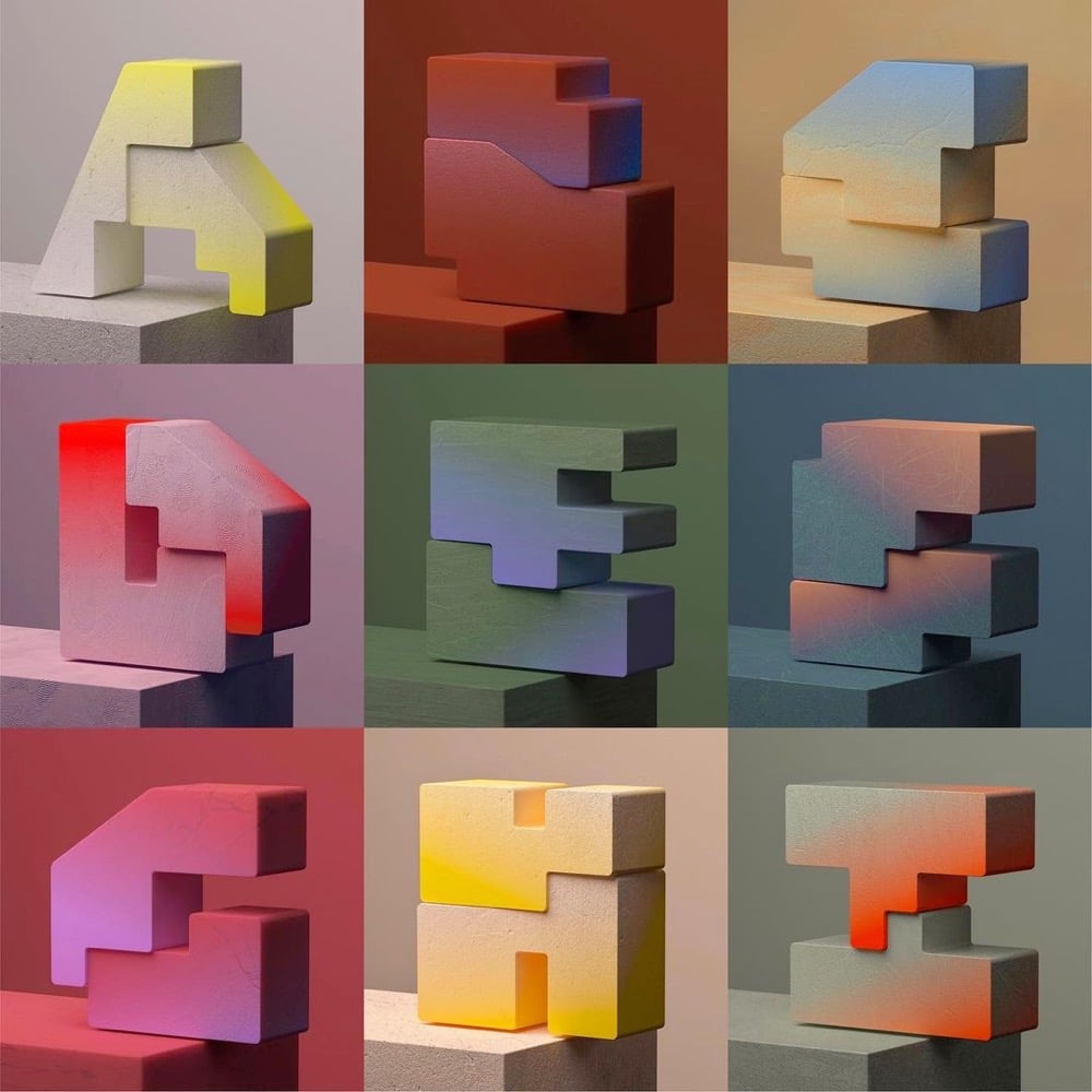
Name Sans is a typeface based on the tile mosaic lettering found in NYC subway stations.
The architects and craftworkers who designed & laid these tiles used a letter construction that was part geometric and part grotesque, with typographic optical corrections often either exaggerated or totally missing. Name Sans interprets these ideas into an extensive type system that is at once anonymous and full of personality, useful for everything from branding to wayfinding to digital interfaces.
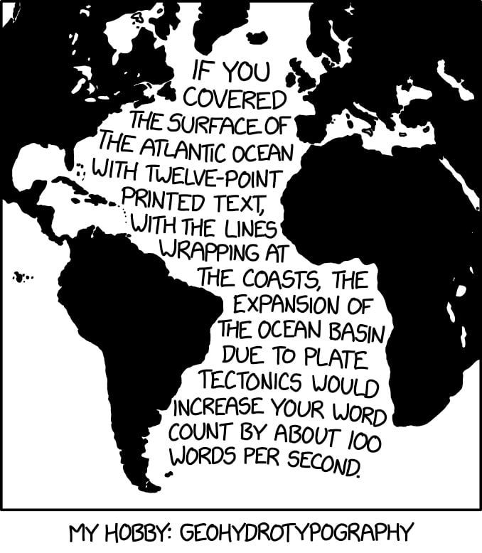
This, from XKCD, hits my science and design interests right in the sweet spot.
If you covered the surface of the Atlantic Ocean with twelve-point printed text, with the lines wrapping at the coasts, the expansion of the ocean basin due to tectonics would increase your word count by about 100 words per second.
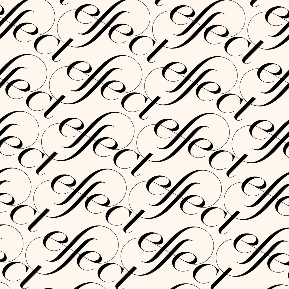
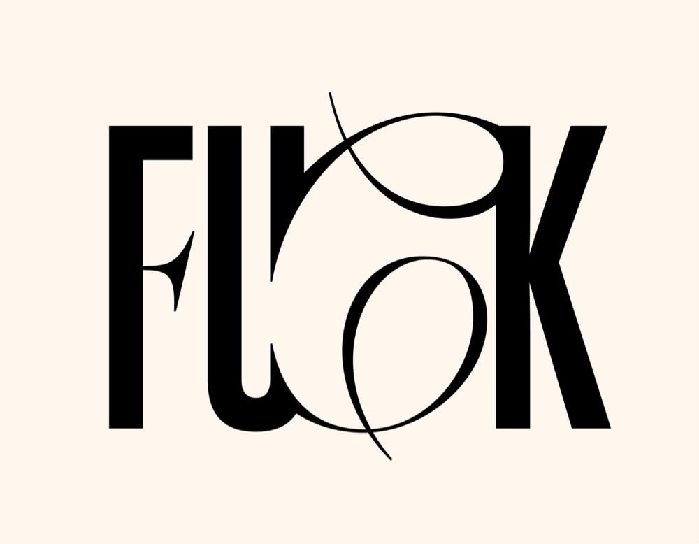
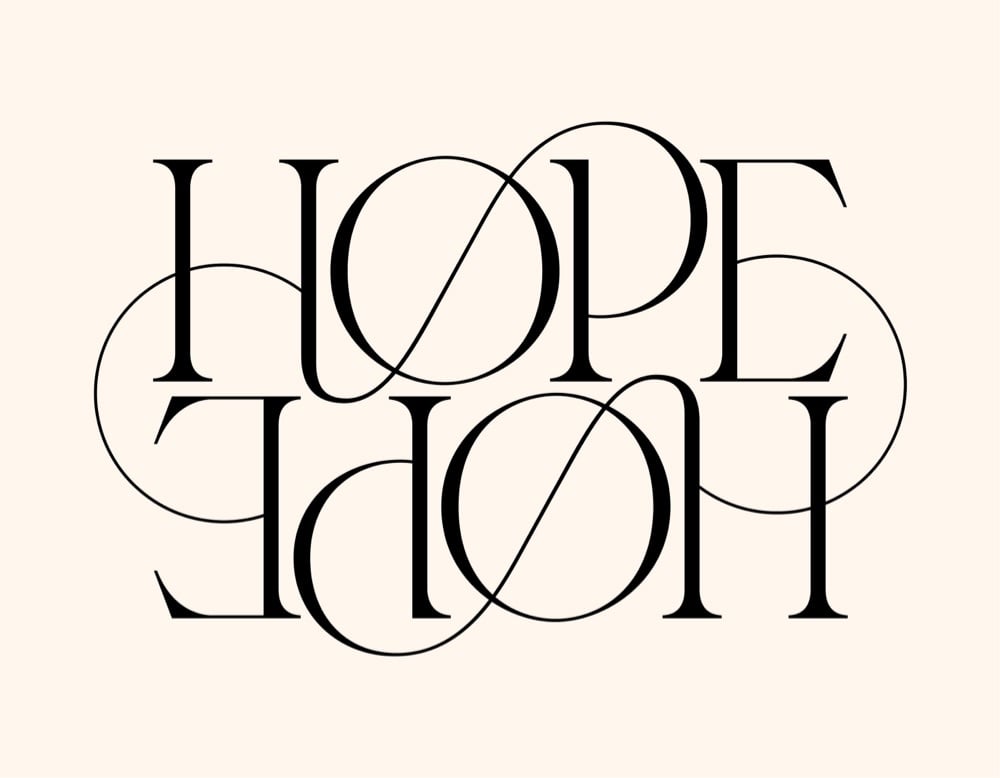
In a pair of collections on Behance, Hungarian designer and artist Miklós Kiss showcases his skill with ligatures and swirling serifs: Type Beast and Type Beast 2.0
I love typography. I love letters. I love to make ligatures and find connections between letters. These are not logos, but sometimes they can be. Sometimes this kind of typography is not readable. Sometimes they look like abstract artworks. Sometimes they look like choreography. I love to watch them move, I love their beauty. I call my little typography monsters my Type Beasts.
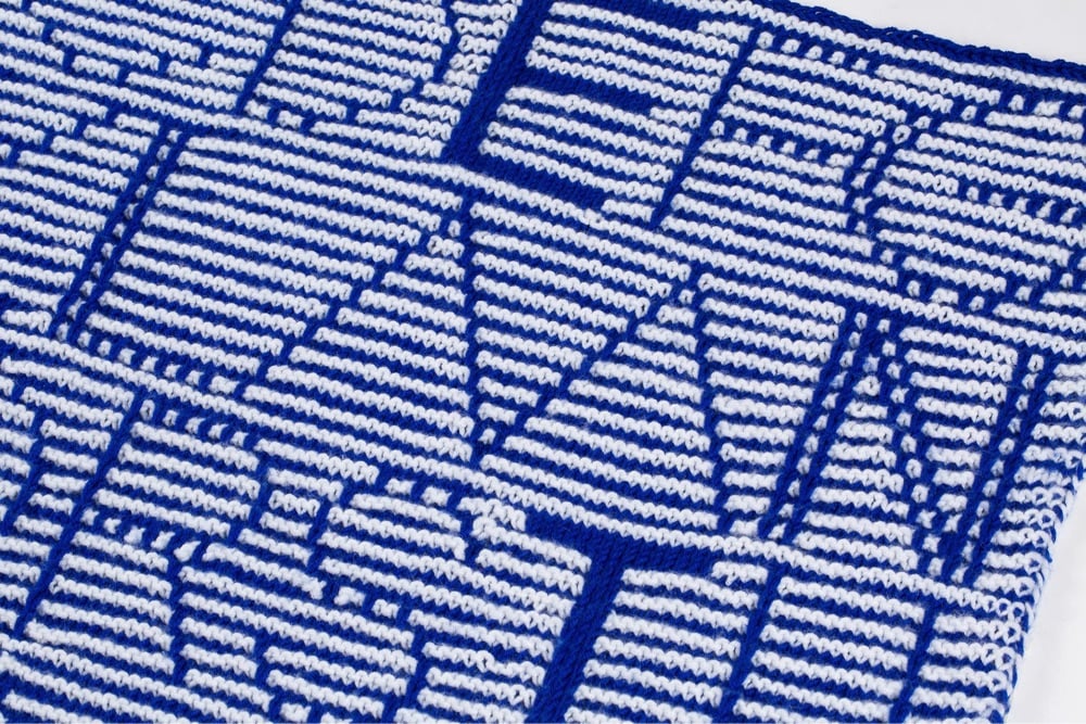
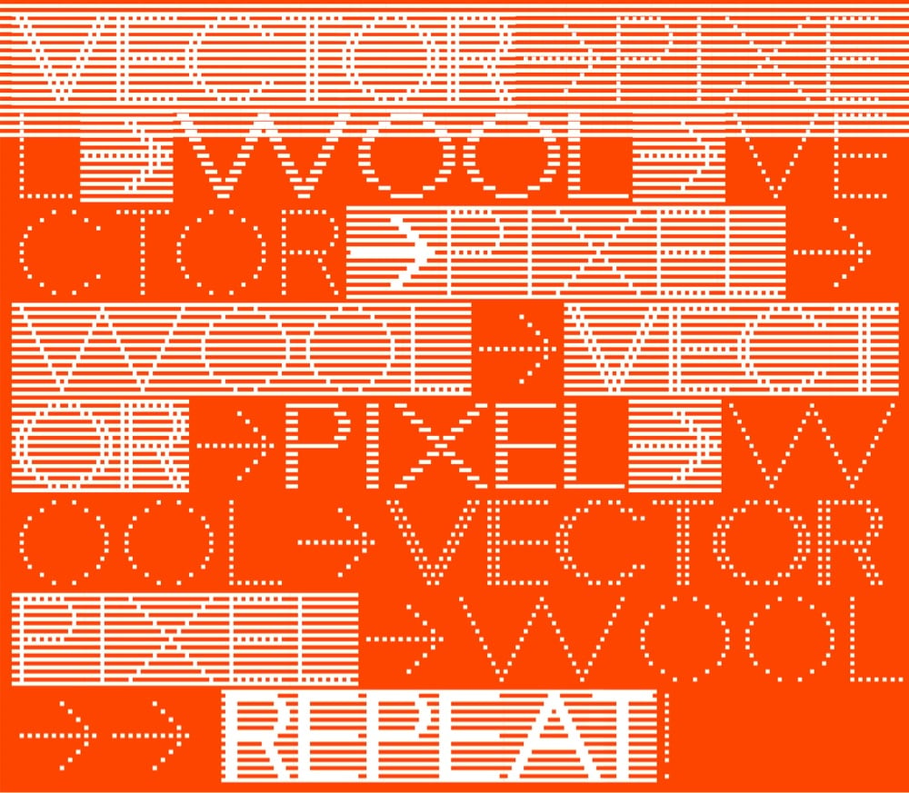
Knit Grotesk is a typeface based on Futura that’s designed specifically for hand knitting. It comes in three different weights and two styles: dots and stripes. Its designer, Rüdiger Schlömer, is also the author of a book called Typographic Knitting: From Pixel to Pattern:
Learn to knit a variety of typefaces modeled on digital designs by well-known type foundries including Emigre, Lineto, and Typotheque, and emblazon your hats, scarves, and sweaters with smartly designed monograms, letters, or words. Beginning with knitting basics, tips, and resources, and progressing through more advanced techniques, Typographic Knitting provides a systematic introduction on how to construct a variety of letter designs using different knitting techniques. This book bridges the gap between craft and design in a new way, and will delight typography connoisseurs, avid knitters, and makers looking for a novel medium.
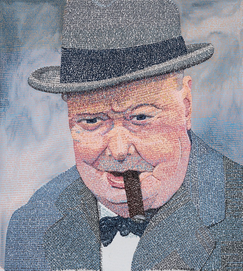
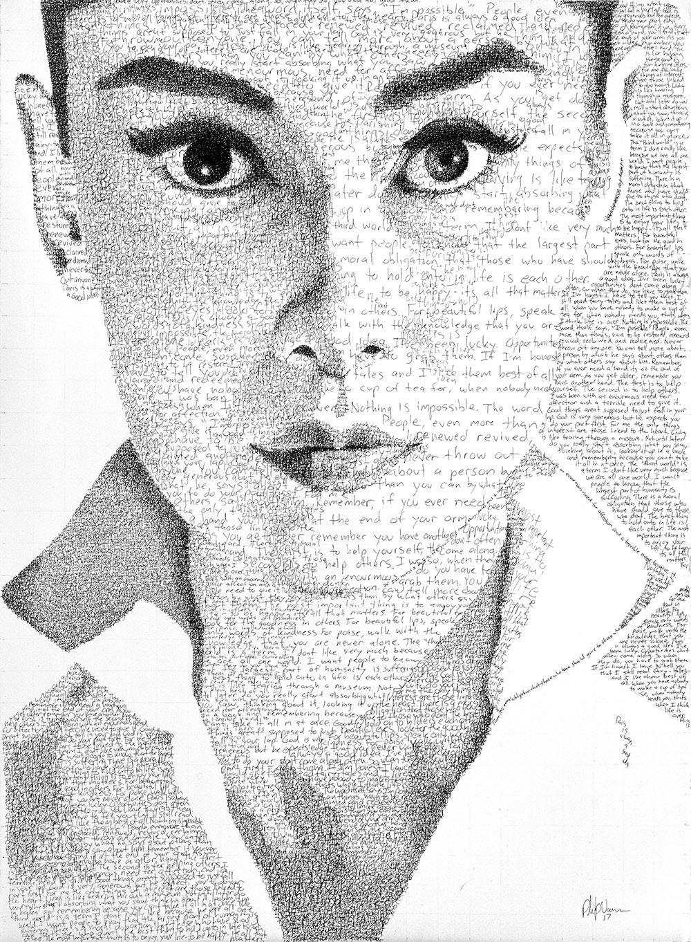
Phil Vance creates these wonderful typographic portraits of notable people like Audrey Hepburn, Albert Einstein, and Johnny Cash constructed from hand-painted type consisting of their own words. For instance, his portrait of Cash was created using the lyrics from his cover of God’s Gonna Cut You Down. You can check out more of Vance’s work on Instagram.
I know I’ve posted this before, but with the new Avatar movie out in theaters, it’s a good time to revisit the SNL sketch where Ryan Gosling is driven mad by the typeface choice for the movie’s logo.
I had forgotten about the title card at the end. Perfection.
There actually is one single person responsible for Avatar’s Papyrus-esque logo: Peter Stougaard. The former senior vice president of creative advertising for 20th Century Fox willingly takes credit for selecting and tweaking the movie’s much-maligned font, but he doesn’t mince words. “I didn’t aimlessly pick Papyrus,” he insists. “I chose it very strategically.”
I can’t believe they got it off of the cover of Cameron’s copy of the script. (thx, matt)
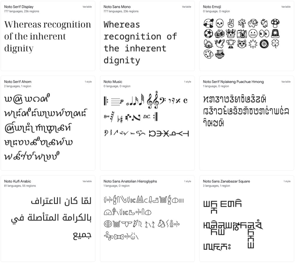
Google has developed a typeface called Noto that seemingly includes every single character and symbol used for writing in the history of the world. I mean, look at all these different options: Korean, Bengali, Emoji, Egyptian hieroglyphs, Coptic, Old Hungarian, Cuneiform, Linear B, Osage, and literally dozens more.
Noto is a collection of high-quality fonts with multiple weights and widths in sans, serif, mono, and other styles. The Noto fonts are perfect for harmonious, aesthetic, and typographically correct global communication, in more than 1,000 languages and over 150 writing systems.
A particular shoutout to Noto Emoji: it supports the latest emoji release (14.0) and includes 3,663 emoji in multiple weights.
Perhaps it’s time for a new typeface ‘round these parts…
Update: I got it in my head that Noto was a new typeface, but it was first released in 2013. But Noto’s monochrome emoji font is new — I think that’s where I got confused.
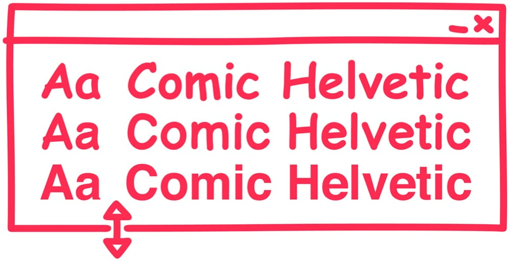
In some workplaces, people use Helvetica to conduct business because it conveys a sense of order and authority. In other workplaces, people use Comic Sans, which conveys a sense of casual chaos. Designer Alexander Pravdin decided to combine the two typefaces into one diabolical font: Comic Helvetic. You can download it here.
If you need me for the rest of the day, I’ll be over in the corner trying to decide where these three typefaces fit on the alignment chart. (via print)
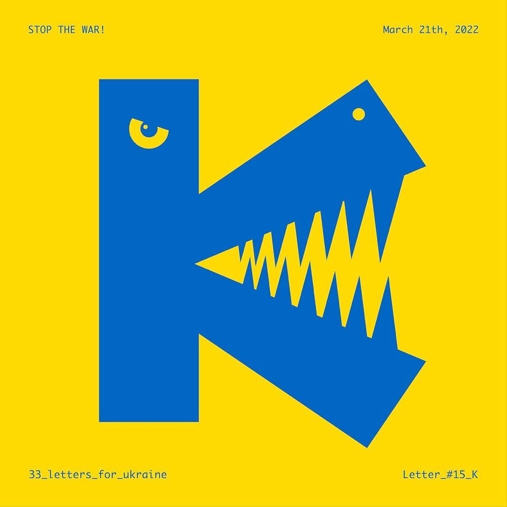
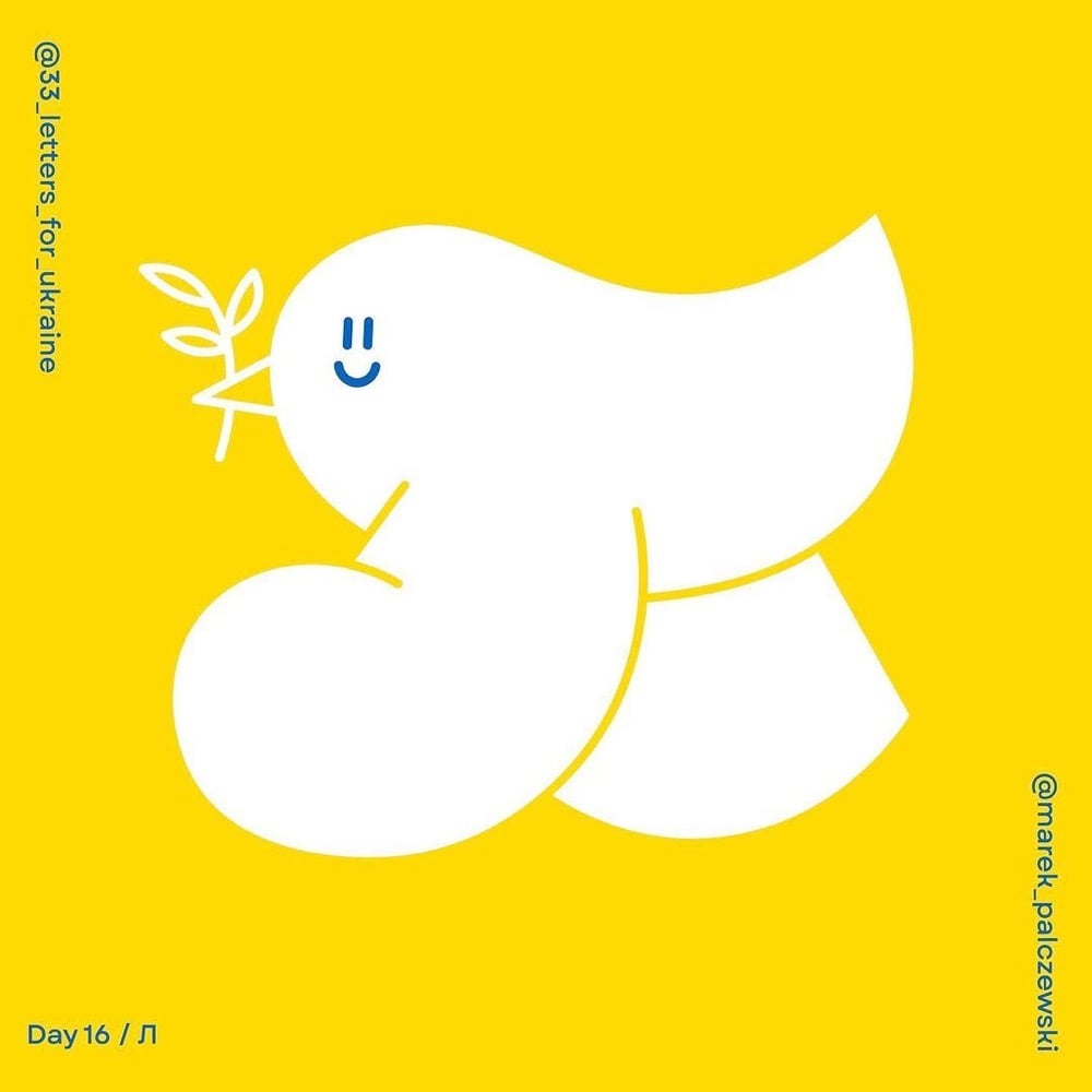
A pair of Polish designers have organized a challenge for designers around the world called 33 Letters for Ukraine: to create letterforms of the Ukrainian alphabet “as a sign of solidarity”. Each day until April 6th, a new letter is chosen and featured on their Instagram account — you can see some of the work above. It’s Nice That has a piece on the challenge.
Speaking on the thinking behind 33 Letters, Alina says: “To put it briefly, we have two main goals for the project — promoting the Ukrainian alphabet and encouraging people to donate to organisations helping Ukraine. The Instagram challenge is an essential starting point, and we loved to see so many designers getting involved and expressing their solidarity by drawing the letters. But equally important are tangible results: collecting funds and education.”
To do so, they are hoping to sell original artworks and prints of the letters once the project has finished, and then they plan to exhibit all of the works as part of a fundraiser, though the venue is yet to be confirmed. “There are amazing designers taking part in the challenge, and it would be great to see their work shine also outside of Instagram,” says Alina.
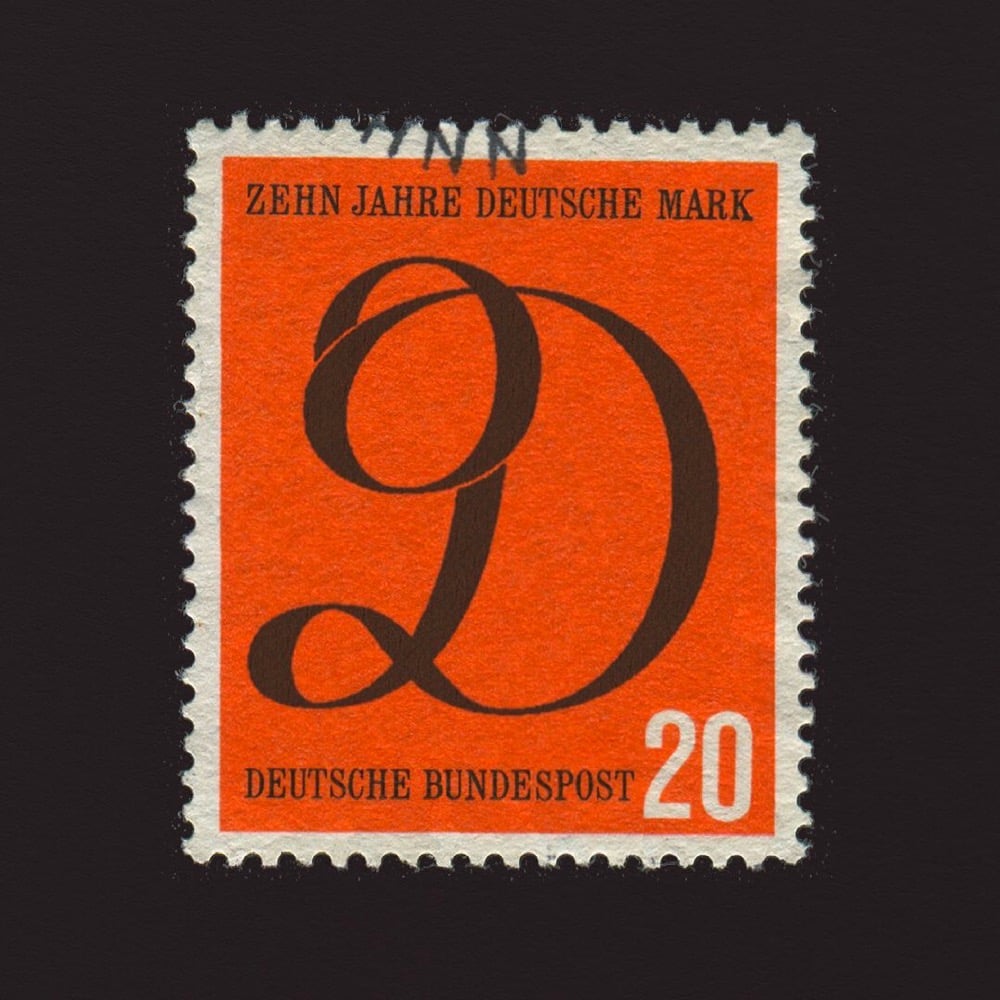
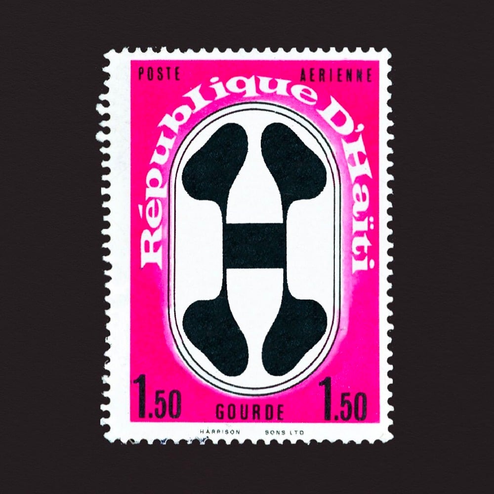
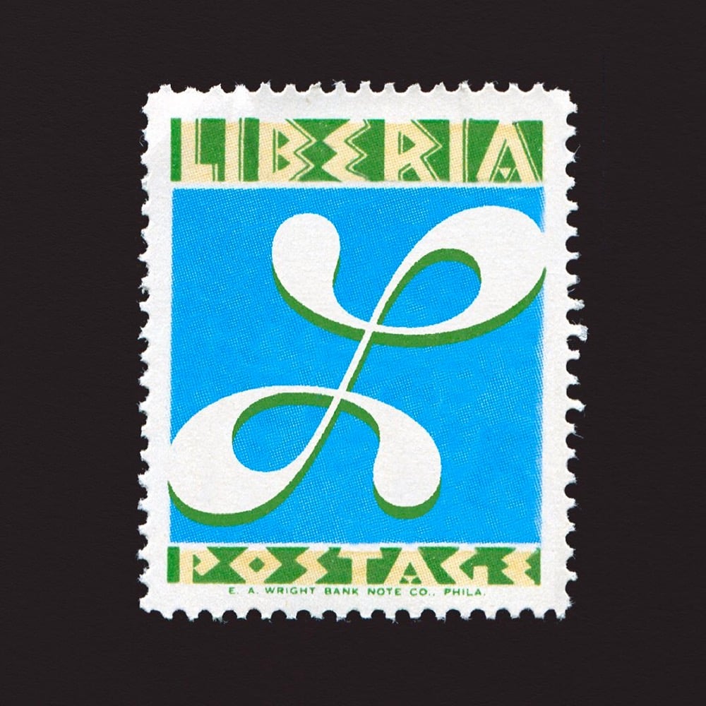
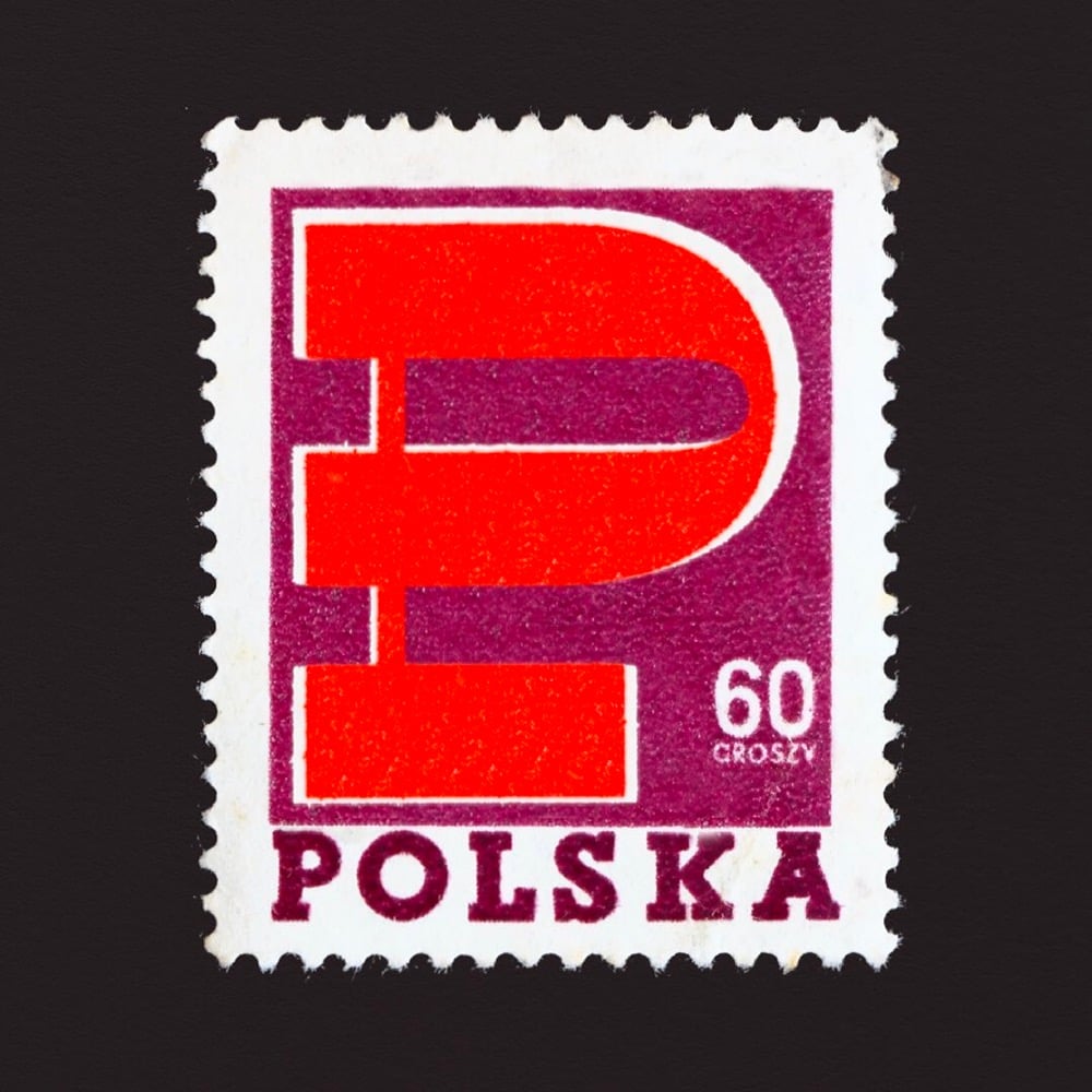
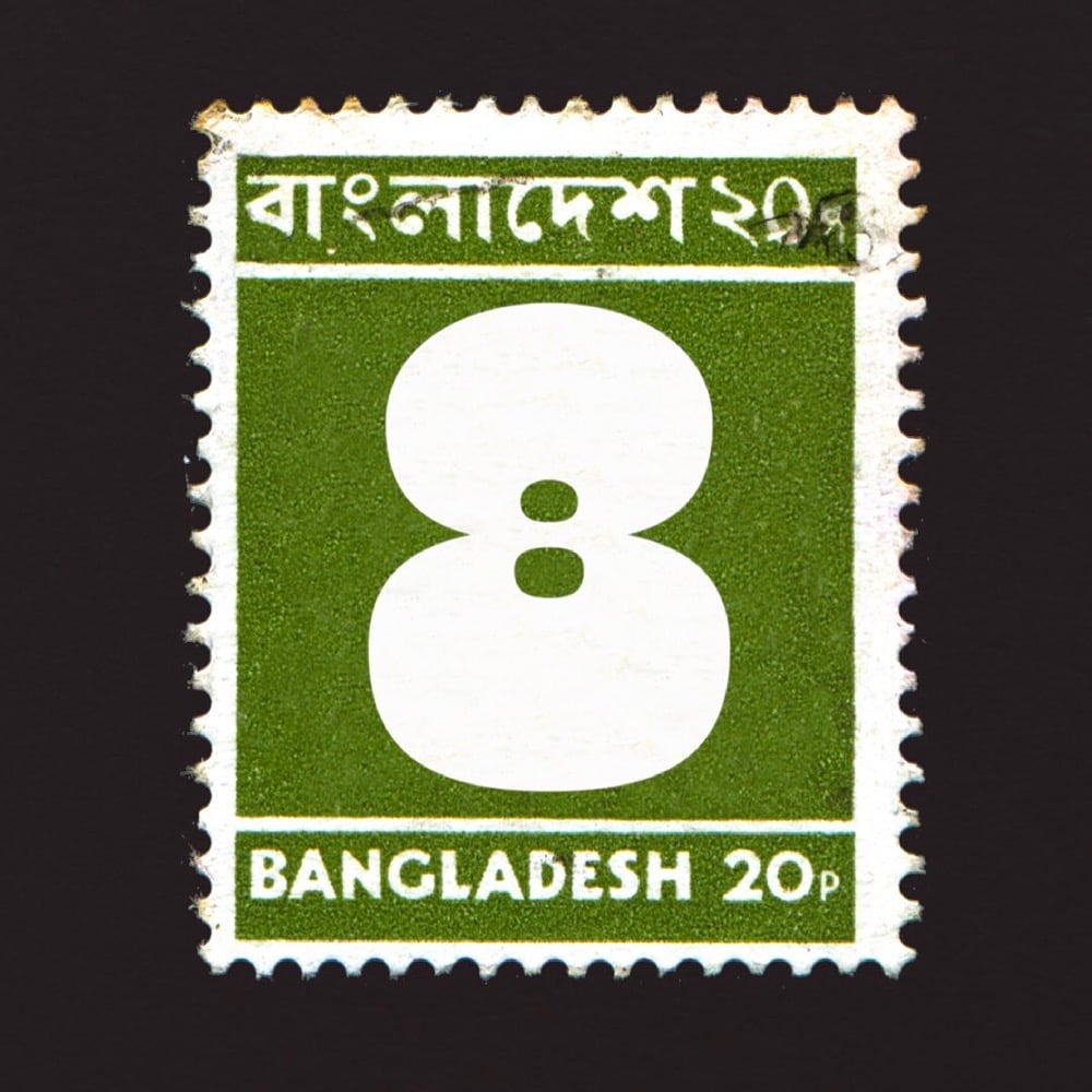
For last year’s 36 Days of Type challenge, artist and type designer Marie Boulanger selected 26 postage stamps from around the world with letters on them (C for Cuba, F for France, K for Kenya, etc.) and 10 stamps with the numerals 0-9 on them. What an amazing array of designs and lettering styles. I’ve included a few of my favorites above — you can see the rest on her Instagram or collected here in miniature.
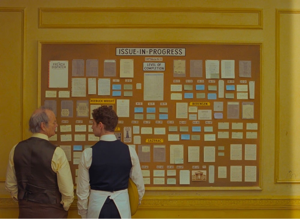
I’m just speaking for myself, but I recently rewatched all of his films in chronological order. You can see typography become a more and more prominent component over time — it’s quite fascinating. In later films like Isle of Dogs and the French Dispatch, it almost becomes its own character rather than a visual or narrative flourish. Especially in a story about writers and publishing, every book, every page, every shop sign, every poster.
Even thinking about the three stories contained within the film, graphic design and typography are really at the core of each one: exhibition posters, protest signs and even menus. You piece a lot of key information together just through certain objects from the set, as well as emotional nuance: humour, joy, sadness. With such a huge part of the narration depending on typography, you have to expect a high level of detail.
Some people can be quite dismissive of Anderson’s work as preoccupied with mere aesthetics, so it’s great to hear Boulanger talk about the depth that something that’s ostensibly aesthetic like typography brings to his films. I loved the use of type in The French Dispatch…so much information conveyed with “just” words. (via sidebar)
For The Believer, Sarah K. Kramer wrote about a typeface called Jim Crow, how it came to be called that (its original name was Gothic Shade), and what its casual use by designers for decades means.
One of Seals’ pet peeves is “stereo-typography” — things like east Asian restaurants with brush-script logos — and in particular, he takes issue with the way designers often use “black weight” (very thick and bold) font to signify African American culture. For example, the Neuland typeface (designed in 1923 by Rudolf Koch) has been used on many covers of books by Black writers, like Richard Wright’s Native Son. One theory on the origin of the association of these black-weight fonts with Black culture is that they evoke woodblock typefaces printed on nineteenth century tobacco ephemera — an industry closely linked with slavery. Needless to say, much of this material featured racist imagery of African Americans. When Seals was contracted by HarperCollins to design a cover for Charles Blow’s The Devil You Know: A Black Power Manifesto, he definitely was not going to use a “black weight” font. Instead, he designed the cover with Ruby.
Ruby is a reworked version of Jim Crow from Tré Seals’ type foundry Vocal Type Co, which I covered here a few years ago. (thx, reed)
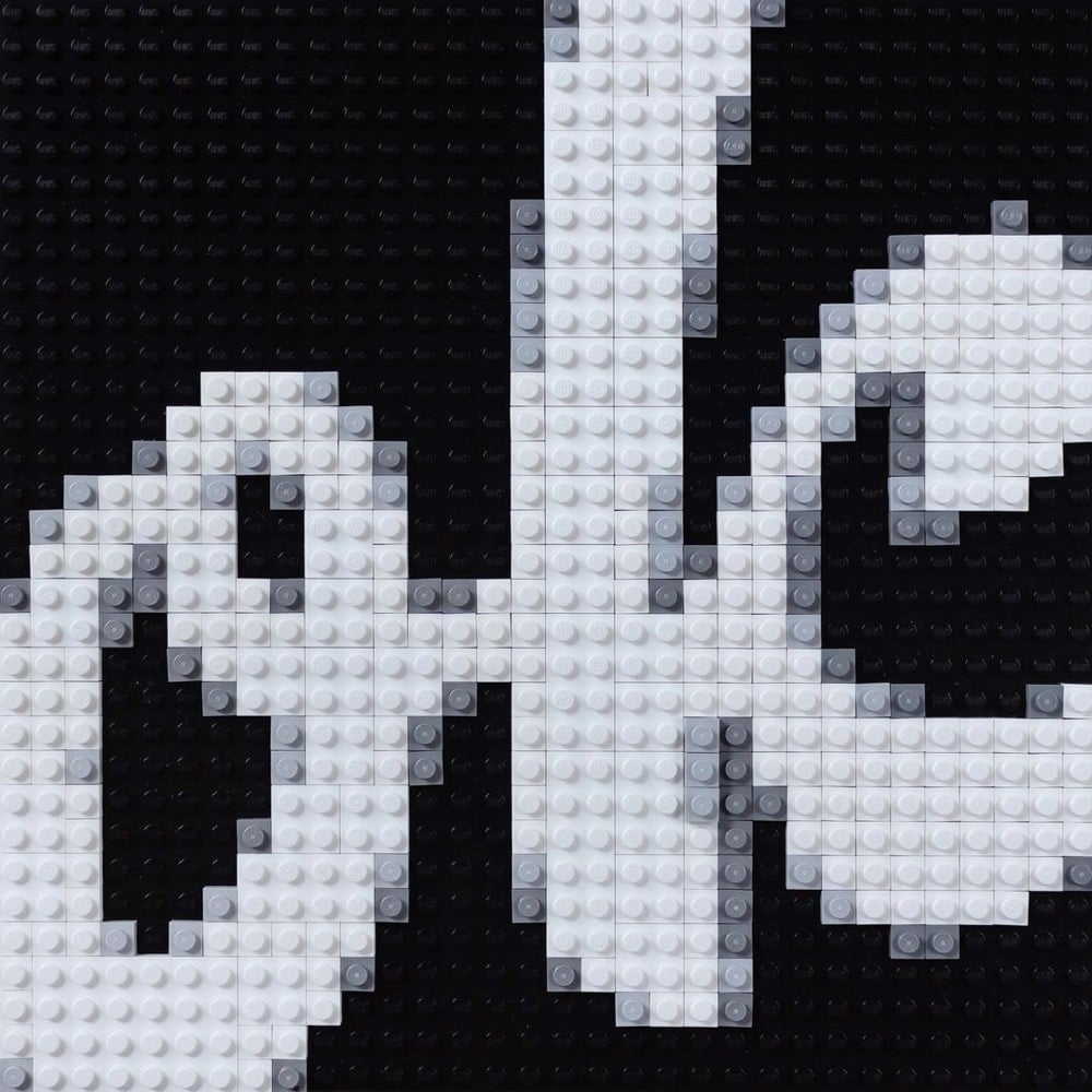
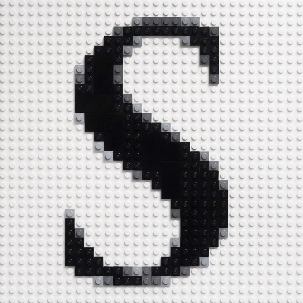
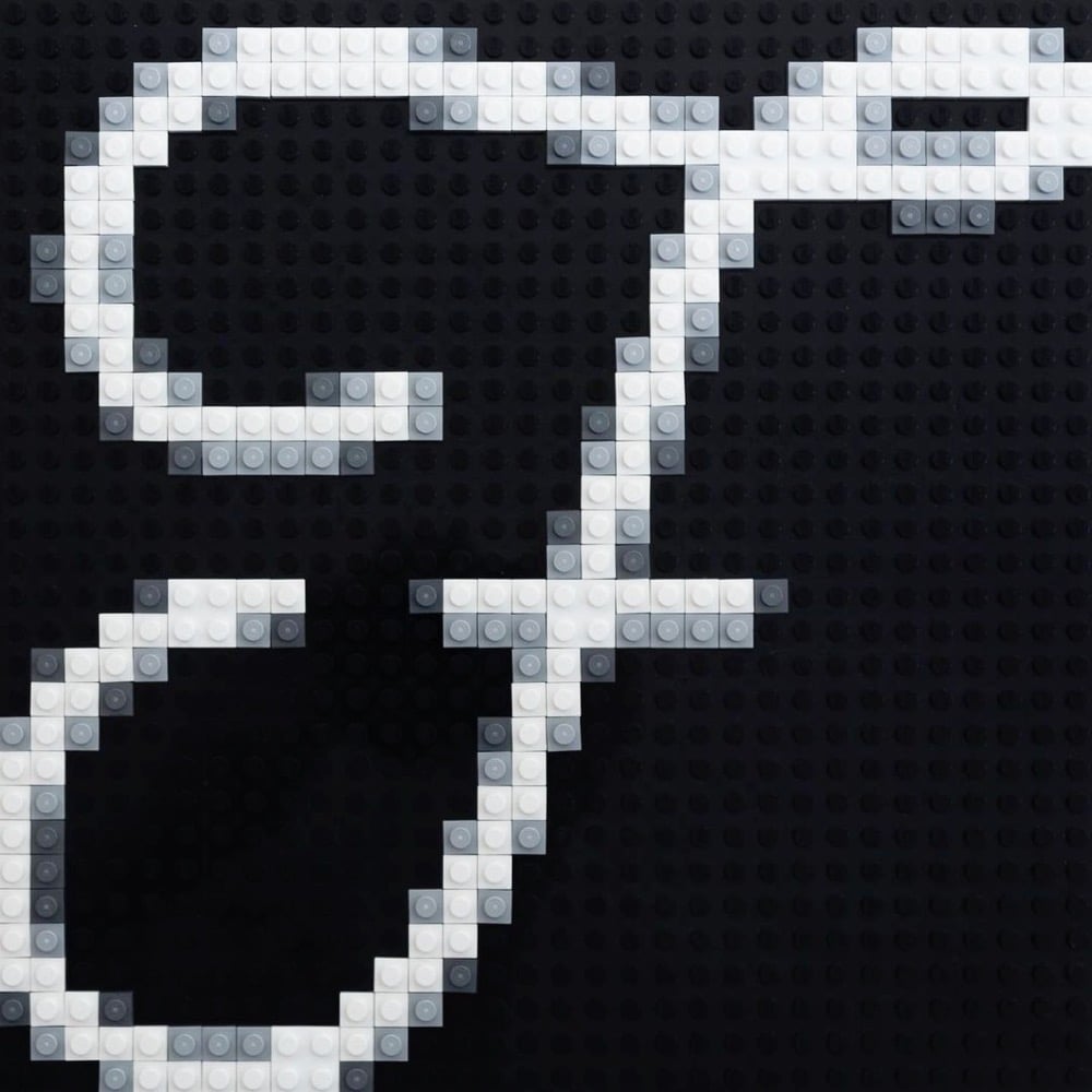
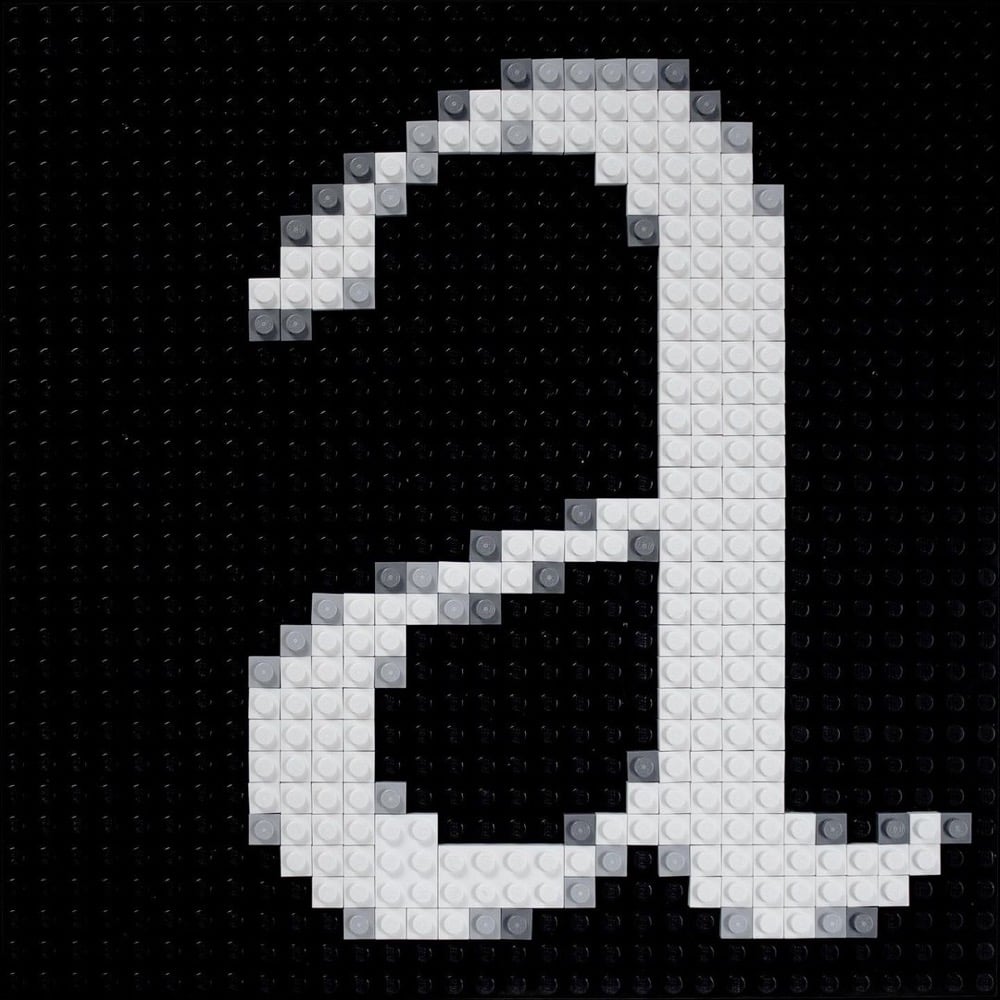
Craig Ward has been creating letterforms using Lego bricks and posting the results to Instagram. The ones I really love are the anti-aliased letters — reminds me of zooming all the way in to do detail work in Photoshop back when I was a web designer.
There is just something so satisfying about meticulously rendering digital artifacts in a physical medium like Lego.
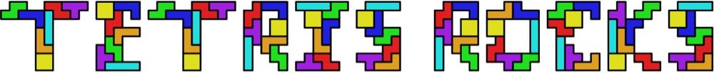
The father-son duo of Martin and Erik Demaine make typefaces that are algorithmic, mathematical, or puzzle-like in nature. For instance, here’s their Tetris font, where each letter is made up of the seven possible Tetris pieces:
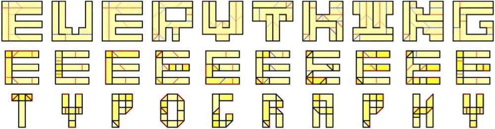
Or their newest one, Everything, where each letter can be folded into any other letter:
Everything to everything. This typeface illustrates how to fold any letter into any other letter, or more precisely, how to fold a piece of paper in the shape of any letter into the shape of any other letter. This lets you write one message inside another in a couple of ways. On the one hand, you could present the 6x6 crease patterns whose silhouettes look like one message (first text), and folding them reveals another message (second text). On the other hand, you could present the folded forms (as physical objects) whose silhouettes look like one message (second text), and unfolding them reveals another message (first text).
In a 2015 paper, “Fun With Fonts: Algorithmic Typography,” the Demaines explained their motivations: “Scientists use fonts every day to express their research through the written word. But what if the font itself communicated (the spirit of) the research? What if the way text is written, and not just the text itself, engages the reader in the science?”
Inspired by theorems or open problems, the fonts — and the messages they compose — can usually be read only after solving the related puzzle or series of puzzles.
You can check out the rest of their typefaces on their website — they include fonts with infinitely tiling letters, Sudoku puzzle fonts, and a font whose letters are made up of shapes that can be packed into a 6x6 square. So fun!
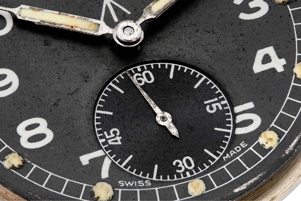
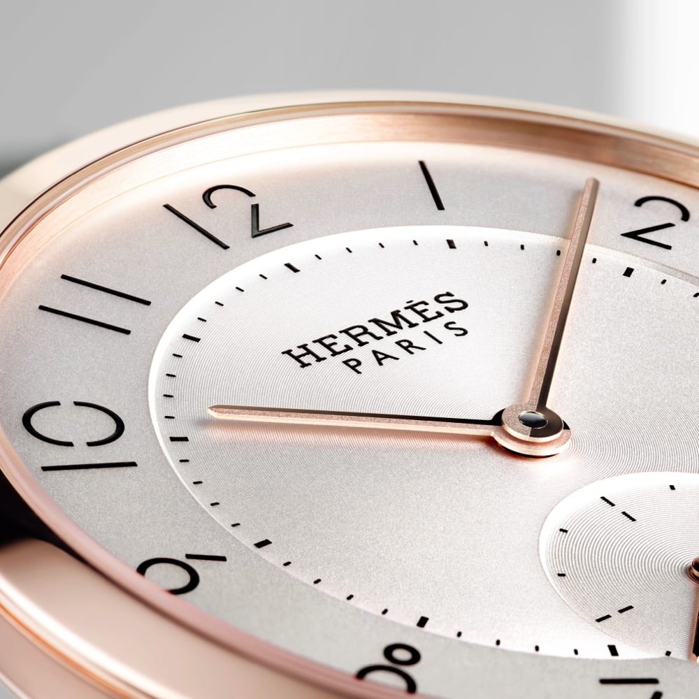
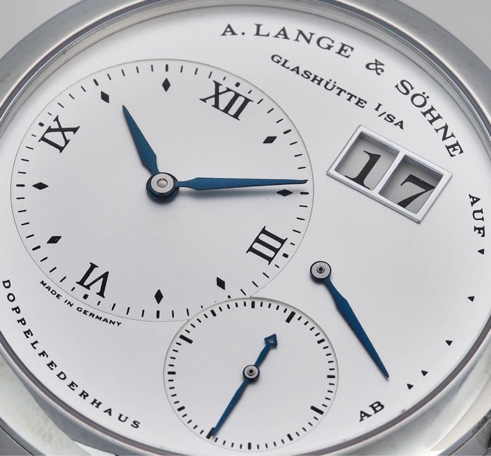
Good typography should be almost unnoticeable. Blending seamlessly into the rest of the design, it should tell you everything you need to know, without you being aware of it. Despite the many restrictions that are applied to dial layout, the creativity that can be seen in typography across horology is quite staggering. To put it simply, typography is the art and technique of arranging type to make written language legible and appealing when displayed. As the dial is the main point of interaction with a watch, it is arguably one of its most important parts, and certainly one that can produce the most emotion. This is why typeface can play such a vital, yet subtle, role in how we experience and feel about a certain piece.
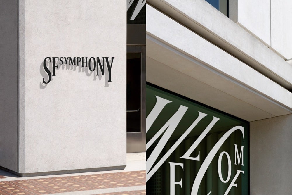
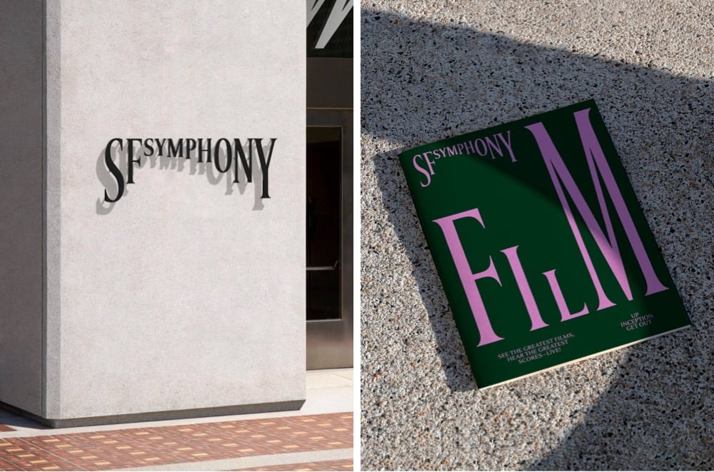
Design studio Collins has created a new brand identity for the San Francisco Symphony that uses type in a playful, almost musical way. This brief video demonstration is worth 1000 words:
Even better, you can experiment with your own type and music with the Symphosizer web toy. I made this (to the beat of Daft Punk):
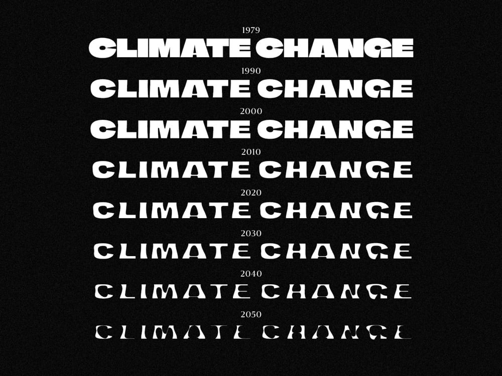
Finnish newspaper Helsingin Sanomat has released a free typeface called Climate Crisis that can help designers and the media visualize the urgency of the climate crisis.
The font is intended to be used by anyone who wishes to visualize the urgency of climate change. Especially the media can use it to enhance its climate-related storytelling through illustrations and dramatizations. Newspaper Helsingin Sanomat is at the moment using the font to draw attention to its climate-related stories.
The typeface has seven weights corresponding to data & projections of the minimum extent of the Arctic sea ice from 1979 to 2050. As you can see in the graphic above, the type gets thinner and thinner as the years pass. (via print)
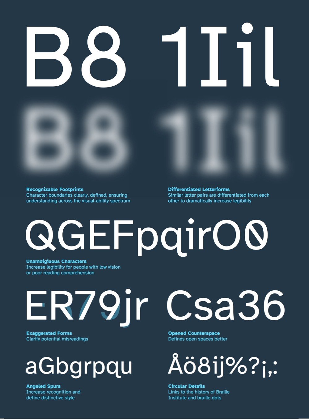
“People may be surprised that the vast majority of the students who come to Braille Institute have some degree of vision,” says Sandy Shin, the institute’s vice president for marketing and communications. “They’re not 100% blind.”
Thus, most of the Braille Institute’s 37,000 clients across Southern California don’t depend on the dot-based Braille language. Instead, they rely on spoken-word tools and accessibility standards that encourage text publishers to think more carefully about the legibility of words on pages.
To celebrate the release of their latest limited edition memo books, Field Notes made a short documentary about The United States of Letterpress, featuring several letterpress practitioners from around the country.
I ran a pedal-powered letterpress machine for a few minutes several years ago and that huge machine whizzing away right in front of me was both magical (it stamps the ink right into the paper and it’s in your hands 2 seconds later) and terrifying (the massive flywheel could have ripped my arm clean off without slowing down). Danger and enchantment, what else do you need really?
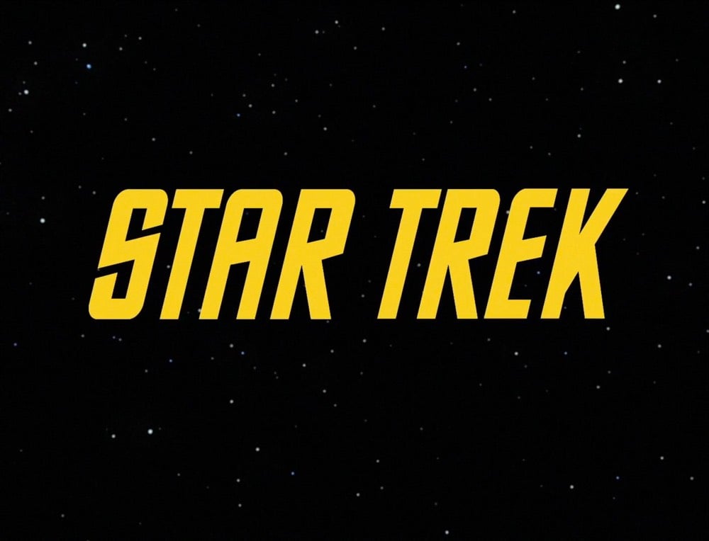
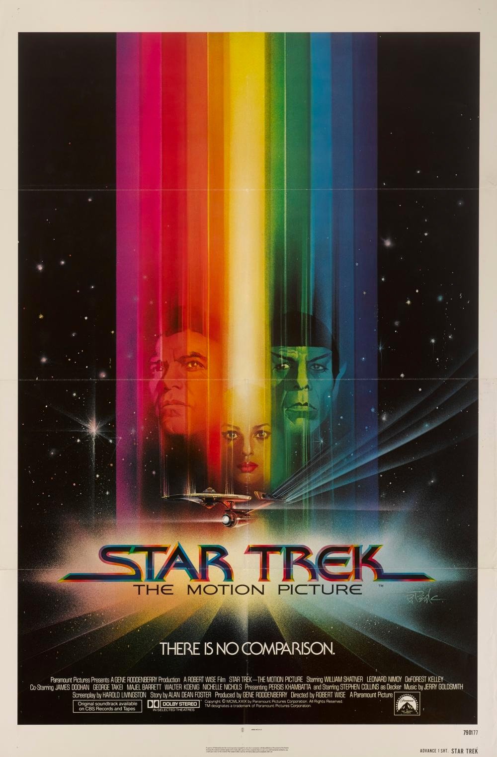
Alas, The Original Series’s inconsistent typography did not survive the stylistic leap into the 1970s. To make up for it, The Motion Picture’s title card introduces a new font, with some of the curviest Es known to sci-fi. It also follows an emerging seventies trend: Movie names beginning with STAR must have long trailing lines on the opening S.


Stay Connected