Photoshop 1.0 came out in 1990 and didn’t have layers, live preview, multiple levels of undo, or many other features. See some current Photoshop experts wax nostalgic and wrestle with the lack of features in this entertaining video.
This poster, featuring a relatively rare appearance by @darth him/her/itself, was just a response to Reuters’ Margarita Noriega tweeting that summer was ending:
Update: I challenged @darth to make a poster for the movie “The World According to @Darth,” using The World According to Garp as a reference. In less than thirty minutes, the poster was born, complete with tiny, perfect textual details that you have to see at full size to fully appreciate.
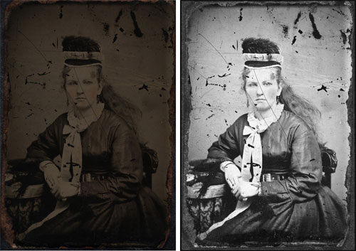
My standard operating procedure is to use an ultra-high resolution camera combined with a top-of-the-line macro lens to photograph tintypes. I use strobe lights to illuminate the artwork. Strobes produce “hard” light, much like the sun on a clear day. In addition to the strobes, I place a polarizer over the camera lens and polarizer gels over the strobe lights. This eliminates all reflections and enables the camera to pick up a greater tonal range along with more detail.
The original photo is on the left and an intermediate step on the right; you’ll need to click through to see the finished product.
Update:This is a better restoration…the one above is too airbrushed, like the photo on the cover of a fashion magazine.
Cory Arcangel has a new show opening tonight at Team Gallery in Soho called Adult Contemporary. I got a peek at it last night and my favorite piece is called Photoshop CS: 110 by 72 inches, 300 DPI, RGB, square pixels, default gradient “Spectrum”, mousedown y=1098 x=1749.9, mouse up y=0 4160 x=0. It’s easy enough to whip up your own by following those instructions in Photoshop but the print itself is gorgeous. When you get up close to it, there is no discernible gradation between the colors and, because it’s so uniform and smooth and glossy and big, you lose your sense of depth perception and you don’t really know how close you are to it. I almost fell over looking at it because I was so disoriented.
Its a single exposure with the model viewed through optical glass at 45° and the fabric positioned to the side. At the time there was zero retouching after the event. Now of course I have the luxury of scanning the transparency to clean and refine the image in Photoshop - God bless its digital socks.
Fashion photo retouching (i.e. high-brow Photoshopping) gets the New Yorker treatment with this story on retoucher Pascal Dangin, one of the best in the business.
In the March issue of Vogue Dangin tweaked a hundred and forty-four images: a hundred and seven advertisements (Estée Lauder, Gucci, Dior, etc.), thirty-six fashion pictures, and the cover, featuring Drew Barrymore. To keep track of his clients, he assigns three-letter rubrics, like airport codes. Click on the current-jobs menu on his computer: AFR (Air France), AMX (American Express), BAL (Balenciaga), DSN (Disney), LUV (Louis Vuitton), TFY (Tiffany & Co.), VIC (Victoria’s Secret).
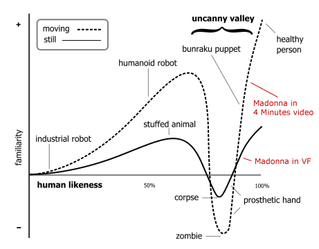
The article touches too briefly on the tension between reality and what ends up in the magazines and advertisements. As Errol Morris points out on his photography blog, it is often difficult to find truth in even the most vérité of photographs. Even so, the truth seems to be completely absent from Madonna’s recent photo spread in Vanity Fair that was retouched by Dangin, especially this one in which a 50-year-old Madonna looks like a recent college graduate who’s never lifted a weight in her life.
The uncanny valley comes into play here, which we usually think of in terms of robots, cartoon characters, and other pseudo anthropomorphic characters attempting and failing to look sufficiently human and therefore appearing creepy and scary. With an increasing amount of photo retouching, postproduction in film, plastic surgery, and increasingly effective makeup & skin care products, we’re being bombarded with a growing amount of imagery featuring people who don’t appear naturally human. People who appear often in media (film & tv stars, models, cable news anchors & reporters, miscellaneous celebrities, etc.) are creeping down into the uncanny valley to meet up with characters from The Polar Express. I don’t know about you but a middle-aged Madonna made to look 24 gives me the heebie-jeebies. Perhaps the familar uncanny valley graph needs revision:
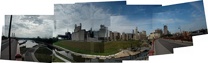
I’m not entirely satisfied with this version. I used a shareware program for OS X called DoubleTake to stitch the images together and it’s not suited for this kind of scene. Too much of the image turned out blurry & fuzzy and you have little control over which pieces of the image take precedent over the others. Some of this was probably user error and on some parts of the image (when there were less pieces involved), it did a wonderful job. I’m going to stitch a version in Photoshop by hand (and put a black background behind it) to see how it compares.
Update: Lots of photo stitching suggestions from people. Jake turned me onto Autostitch a few weeks ago, but alas it’s not available for the Mac, nor do I have one of those fancy MacBooks on which to run Parallels. Calico is an OS X app that uses the Autostitch code, I may check that out. Photoshop CS has a built-in Photomerge tool that does panoramas. Hugin is a GPLed image stitcher that works on Windows and OS X. (thx galen, dan, jake, arlo, joe, glen, jason, and nicholas)
Stay Connected